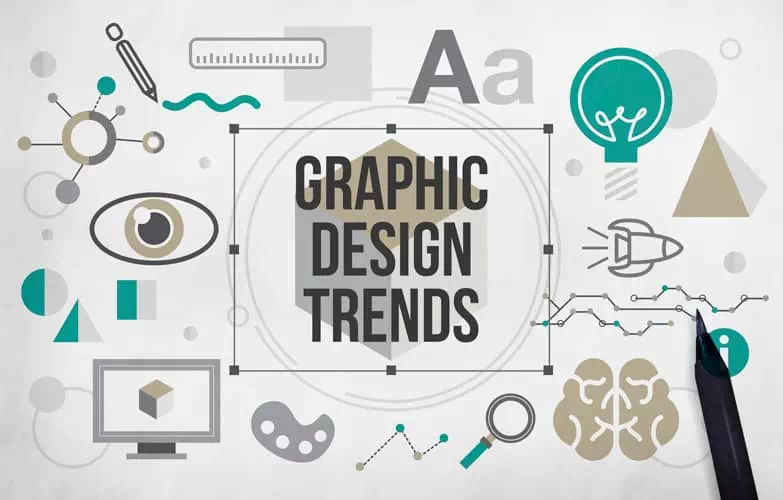
It is essential for designers to keep up with the most recent trends in graphic design. This helps to produce designs that have an impact and are appealing. New styles, methods, and approaches emerge as design trends change. It influences audience preferences and shaping the visual landscape. Designers can remain relevant. They provide cutting-edge designs, and convey their clients’ messages.
Well! We will investigate some latest graphic design trends that creators ought to follow to hoist their work. Let’s dive in and discover the exciting trends that are shaping the future of graphic design!
You may also read– Types of Graphic Design.
Bold and Vibrant Colors
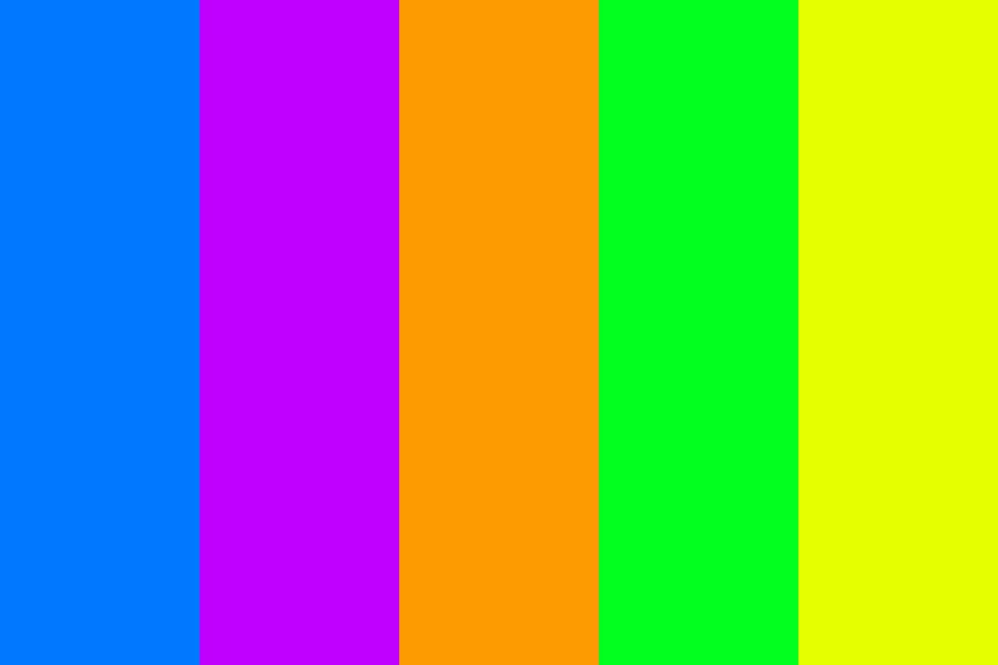
In recent times, graphic designers have been using bold and vibrant colors more. Graphic artists are using colors to evoke emotions. They also use colors to create visual impact and allure audiences. Vibrant and saturated color schemes are popular. They are replacing more muted and subdued tones.
Moreover, designers are experimenting with bold and unexpected color combinations. They are pushing the boundaries. They are embracing unconventional pairings that create striking contrasts and grab attention. And, This fearless exploration of colors adds originality and uniqueness to the designs.
Another technique gaining traction is the use of color gradients and duotones. Gradients transition between two or more colors. They create depth, dimension, and a sense of movement. Besides, they add a modern and dynamic touch to designs, making them captivating. Duotones involve using two contrasting colors. It creates compelling images.
Minimalist and Clean Designs
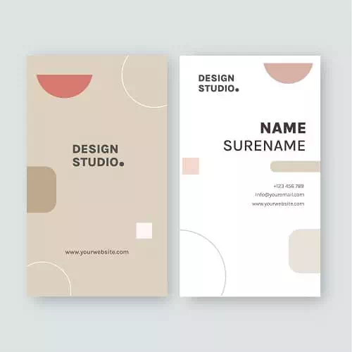
Well! There is a rising appreciation for minimalist and clean designs. Minimalist design prioritizes simplicity and transparency. Complex and cluttered designs are being replaced by clean, uncluttered compositions. This allows the core message to shine through.
Negative space, also known as white space, plays a crucial role in minimalist designs. This strategic use of negative space adds elegance and sophistication. It also improves readability and comprehension.
In minimalist designs, typography takes center stage. We favor clean and legible typefaces, emphasizing readability and simplicity. Designers choose sans-serif fonts. They have minimal embellishments. And, they focus on clear communication, not decorative elements.
Organic and Hand-Drawn Illustrations
As a designer, you’ll always look for ways to bring authenticity, warmth, and a human touch to their work. This is important as digital design becomes more common. The aesthetic of hand-drawn illustrations is unique and exciting. It fosters a deeper connection with readers. Hand-drawn illustrations can transmit personality, originality, and artistry. This capability has made them popular.
Organic shapes and imperfect lines are integral to hand-drawn illustrations. Graphic artists are moving away from rigid geometric forms. These organic shapes add a sense of naturalness and softness to the designs. Besides, they create a more inviting and approachable visual language.
Playful and whimsical illustrations have also become a hallmark of this trend. Try to explore imaginative and fantastical realms. Infuse their illustrations with a touch of magic and wonder. These whimsical illustrations engage viewers. Also, they evoke a childlike sense of joy and curiosity.
Typography as a Focal Point
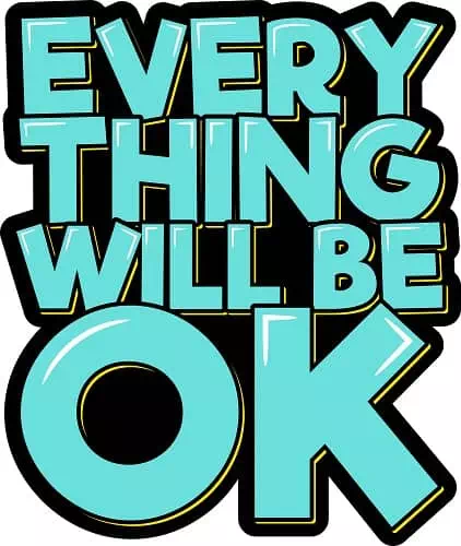
Typography is no longer a means to convey information. It has become a design element and one of the crucial graphic design trends in its own right. One notable trend is the dominance of bold and expressive typography. Bold typefaces have strong strokes and thick letterforms. They create visual impact and serve as the focal point of the design.
Custom and unique typefaces are also gaining traction in contemporary design. This shift allows for greater creativity, originality, and brand differentiation. You can create a distinct visual identity using unique typefaces. Also, you can reinforce the brand’s personality.
Typography is about more than looks. It is essential for communicating ideas and telling stories. Both designers and artists can’t avoid the power of typography. It’s a key element in branding and storytelling. Thoughtfully chosen typefaces can evoke emotions. They can set the tone and convey the brand’s values and personality.
Three-Dimensional and Isometric Designs

Designers are using 3D elements to make immersive experiences for viewers. They want to engage the audience. The integration of depth and realism through 3D elements. By adding depth, objects appear more tangible. And viewers can perceive a sense of space and dimension.
Isometric designs have gained popularity for their unique perspective and geometric precision. It involves rendering objects at a 30-degree angle. This style allows artists to showcase complex structures, products, or environments.
Shadows and lighting play a vital role in creating depth and dimension in 3D and isometric designs. They add a sense of realism and grounding the objects in the design. The interplay of light and shadow creates highlights, gradients, and depth cues. It enhances the visual experience.
Gradients and Translucency
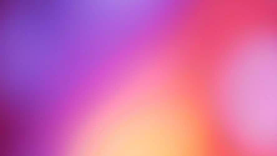
Gradients and translucency have become powerful tools for creating immersive designs. One prominent trend is the creative application of gradients in backgrounds and elements. Gradients involve a smooth transition of colors from one shade to another. It creates a pleasing blending effect.
Translucency, often achieved through the manipulation of opacity. It allows designers to create subtle layering effects within their designs. You can establish a hierarchy, emphasize focal points, and create a sense of depth.
Another effective use of gradients and translucency is the creation of gradient overlays. Apply gradients over images or elements to add visual interest, depth, and texture. By placing gradients with varying opacity, it becomes easier to create a sense of depth.
Abstract and Geometric Shapes
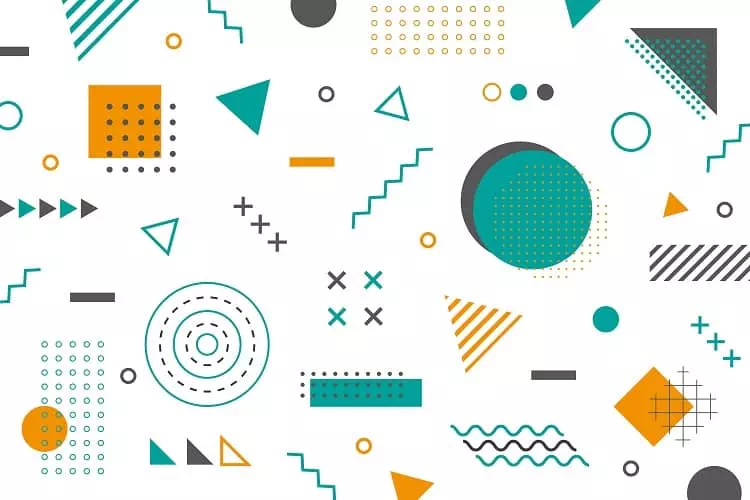
The incorporation of abstract and geometric shapes allows designers to break away from literal representations. And it embraces a more artistic and expressive approach. These are some of the latest graphic design trends. They can convey emotions, ideas, and concepts. You can try the versatility of shapes to create engaging compositions.
An exciting trend in contemporary design is the exploration of asymmetry and unconventional layouts. Abstract and geometric shapes provide a perfect opportunity to experiment with unconventional arrangements. It creates designs that feel fresh, dynamic, and captivating.
Shapes are not just decorative elements. They can also serve as visual metaphors and storytelling devices. Better try shapes to convey ideas, represent concepts, or evoke specific emotions. For example, a circle can symbolize unity or harmony. Jagged edges and sharp angles can represent tension or conflict.
Mixed Media and Collage
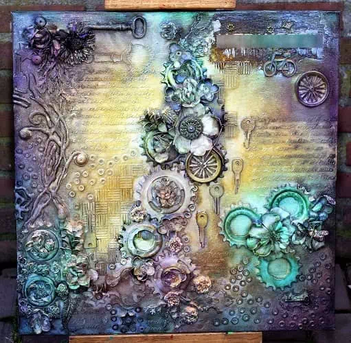
One significant feature of mixed media design is the integration of several media elements. It can be like photographs, illustrations, textures, and typography. This procedure opens up a world of artistic possibilities. Also, it enables for the incorporation of diverse visual assets. All in all, it can boost the visual impact.
Collage-style designs have gained popularity for having a unique and eclectic look. Piece together disparate elements, such as photographs, illustrations, and textures, to form a cohesive and intriguing composition. Collages allow for a playful juxtaposition of different visual elements. They create unexpected and dynamic designs.
The use of mixed media and collage also involves playful combinations of textures, patterns, and visual elements. Experiment with different textures, such as paper, fabric, or digital textures. It helps to add depth and tactile qualities to their designs. These patterns can be geometric, organic, or illustrative.
Dynamic and Interactive Design Elements
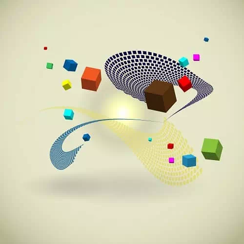
Dynamic and interactive design elements are essential in the evergreen graphic design trends. They create engaging and immersive experiences for users. One significant trend is the incorporation of motion graphics and animations. These elements create a sense of vitality and draw the viewer’s attention.
Interactive elements play a crucial role in engaging user experiences. It allows users to actively participate and interact with the content. Besides, scroll-triggered animations have gained popularity as a means to enhance user engagement. You can use these animations to reveal content, trigger transitions, or provide subtle visual cues.
Microinteractions are another valuable tool in dynamic and interactive design. These are small, subtle animations or interactions that occur in response to user actions. They can be as simple as a button changing color when hovered over or as complex as a form validation animation. Microinteractions provide feedback, enhance usability, and create a sense of responsiveness.
Neumorphism and Soft UI
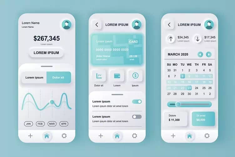
Neumorphic design aesthetics embrace the use of soft shadows, gradients, and rounded shapes. But why? To create a pleasing and tactile user interface. Designers employ subtle shadows and highlights to mimic the appearance of physical objects. This adds depth and realism to the interface. Designers use soft gradients to create smooth transitions. This gives elements a soft and inviting appearance.
Neumorphism aims to enhance user engagement. It also aims to provide a more intuitive experience. The use of depth and realism helps users understand the interactive elements and their functionality. By creating designs that mimic real-world objects and interactions, users feel a sense of familiarity. This makes the designs easy to use.
Besides, neumorphism combines skeuomorphic elements and minimalistic interfaces. It creates a balance between visual appeal and functional simplicity. Designers can create user interfaces that are pleasing. They can also make them intuitive to use and provide a delightful user experience.
Sustainability and Eco-friendly Design

Once again, Sustainability and eco-friendly design have arisen as a critical pattern in the visual communication industry. The trend has many facets. For example, it uses friendly design methods and sustainable materials. This may involve using recycled or responsibly sourced materials.
Integrating eco-friendly icons, illustrations, and visuals has become a prominent feature in design. Illustrations and visuals featuring eco-friendly practices, such as cycling, gardening, or using public transport. They are used to promote sustainable lifestyles and behaviors.
Aesthetically, sustainability and eco-friendly design often embrace earthy color palettes, natural textures, and organic shapes. Earth tones, such as greens, browns, and blues, evoke nature and eco-awareness. Besides, natural textures can add depth and authenticity to designs.
You may also read– T-Shirt Design Ideas.
To Wrap Up
As we conclude, we encourage designers to embrace experimentation and innovation. The realm of graphic design is ever-evolving. These trends offer a base for exploration and pushing creative boundaries. You can create designs that attract, inspire, and leave a lasting impact.
Remember, as a designer, you have the power to shape the visual landscape. You can influence how we collaborate with the world. So, be bold, be visionary, and let your creativity soar. Take advantage of the most recent and unique graphic design trends. AND, it adapts them to your personal style, and keep growing as a designer.

