A logo is every company’s visual identity. It gives an iconic possession to the consumers and made them simplified into an icon. Brands’ images and brand values have been crucial elements for corporate companies. So, logos are playing a vital role in representing them. Famous logos with hidden meanings can make your image stronger, things of a buzzword, and you will get enormous publicity. You will be superbly benefitted later from having a stunning logo design.
The famous companies have their famous logos with hidden meanings. And these logos often contain hidden messages, and secrets, and also have some logo design mistakes. Here we’ll get every single fault, amazing secrets, and the hidden messages a logo has got. Let’s discuss the weaknesses of the famous logos, secrets of the famous logo, and hidden meanings in the famous logos.
Famous logos with hidden meanings
Can you spot the hidden secrets in the images? Get ready to have your mind blown totally.
Things aren’t always looking like what they seem at first glance. And these logos have proved it. Check out these amazing famous logos. You may not realize that they have hidden double meanings very secretly.
FedEx
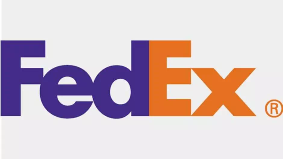
The shipping company’s amazing logo is probably one of the best-known in the world for its “hidden image” types. For those who are not aware, take a closer look between the “E” and the “X,”. Here the negative space forms an arrow.
In an interview with the logo’s designer, Lindon Leader. He said, “The arrow could connote the forward direction as well as speed and precision. If it remained hidden, it might be an element of surprise, that aha moment.”
The design of this logo has won over 40 awards. it was also ranked as one of the eight best logos in the last 3 decades by Rolling Stone magazine.
Wendy
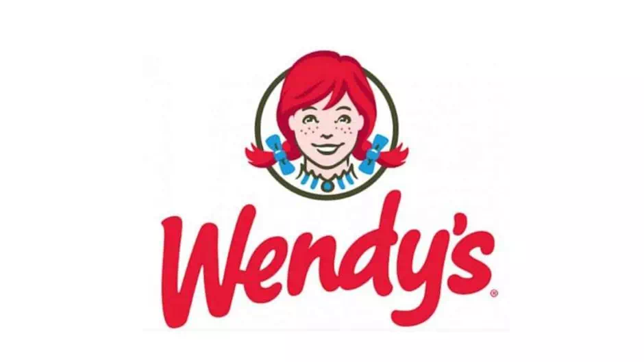
This amazing design was famously founded by Dave Thomas. Wendy’s brand identity signifies and highlights a personal and “home-cooked” feeling. Take a very closer look at Wendy’s collar. You can just see the word “mom.” Wendy’s, name was after Thomas’ daughter. Now it has more than 6,500 restaurants worldwide.
Baskin-Robbins
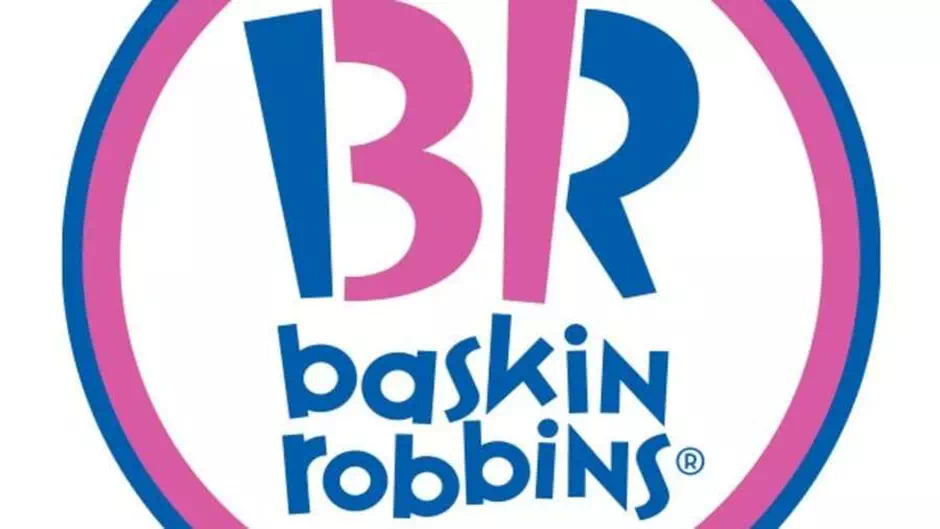
Baskin-Robbins is one of the world’s largest chains of ice cream shops, owned by Dunkin Brands. It is most popular for its amazing 31 flavors. The company’s pink and blue colors depict a large “BR”. That doubles as the number “31” which reflects the 31 flavors of course.
How amazing is this! Carol Austin, the VP of marketing for this company, told CNBC that this logo is “meant to convey the fun and energy of the Baskin-Robbins brand” as well as with the iconic 31. Hold on, the fun is not complete. There is another meaning to this 31.
It means the guest should have an opportunity to explore the 31 flavors in 31 days in a full month. Amazing isn’t that?
LG
At first glance, you might think that the dark pink logo for LG Electronics is a winking face. Wait a bit and look again. You’ll see the “nose” of this face is an “L” and the outline is a “G.” Wonderful, isn’t it?
Tostitos
The logo for tortilla chips and the dips manufacturer company of Tostitos, owned by PepsiCo. It is a prime example of that saying is “once you’ve seen it, you can’t un-see it.” Initially, the logo appears as Tostitos name on the front with a vibrantly colored background in it.
However, the two “T’s” of that logo make up people, as they dip the tortilla chip and take it into the bowl of salsa on top of the letter ‘I’.
Hershey’s Kisses
This logo is famous for its chocolate and also the appropriately themed amusement park, Hersheypark. The logo on Hershey’s Kisses product has a hidden thing in it: an extra Kiss. Turn your head to the left and then you can see that between the ‘K’ and the ‘I’. Actually, Hershey’s extra Kiss is baked into the logo.
Hope for African Children Initiative (HACI)

Supporting the African communities is the basic main pillar of HACI’s mission. Logo designers depicted it in the organization’s vibrant logo. The Hope for African Children Initiative’s golden yellow and orange logo uniquely utilizes the negative space. It is for to create two images: the entire continent of Africa and a child who is looking up at a mother.
Toblerone

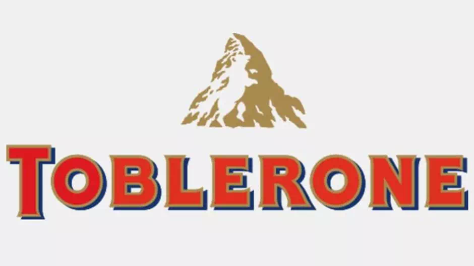
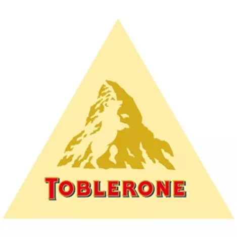
The brand, Toblerone, owned by Mondelez International (formerly Kraft Foods), was started in the town of Bern, Switzerland. A city famously associated with the bears. Now take a little closer look at the logo’s mountain. You’ll get a bear’s image.
It is a digital pinboard site, Pinterest. It tied its logo directly to the social network’s core. While the hidden image may not be immediately obvious. But it is certainly fitting for the platform. The letter “P” doubles as a pin. Michael Deal, the co-designer of the Pinterest logo, said: “
For most of the project, we avoided making visual references to the image of a pin because it seemed too literal. But the “P” actually started to show itself too well as the shape of a map pin.”
Goodwill Industries International
This community-based philanthropist organization prides itself on making people’s lives more than better. With the trademark, they try to prove it. It’s not a surprise that the not-for-profit’s logo makes the best use of some simultaneously functional images.
The area actually encourages the lettering: the lowercase “G” in the “goodwill” logo doubles as a smiling face and appears twice in the logo.
Formula One/F1
Formula One racing is a kind of organization that took the sport’s core values. It uniquely applied them to its logo. The red color here represents passion and energy. While the black color represents immense power and determination. With another play on the negative side of the space, it is noticeable that the F1 logo is more than a black “F”.
The red racing stripes and the space between these two domains of the main focal points actually reflect the number 1.
The Bronx Zoo
The Bronx Zoo, located in the Bronx, a borough of New York City. It is the largest zoo in North America and also is among one of the largest metropolitan zoos in the world. The zoo’s logo featuring the three birds and two giraffes pays homage to the zoo’s own home city.
The main secret is when you look Between the legs of the two giraffes. You’ll see New York’s iconic skyline.
Toyota
This car manufacturer’s logo design certainly encompasses more than meets the eye. Toyota company said that the three overlapping ovals on the American vehicles “symbolize the unification of the hearts of our customers with the heart of Toyota products.
The background space is representing Toyota’s technological advancement through those decades and the boundless opportunities.
NBC
Have you ever noticed the peacock on the image in the NBC logo? The most recent one makes it hard to spot. In the older versions, the peacock was more visible. The peacock faces towards the right side. It symbolizes the company’s motto to look forward.
Big Ten Conference
If you knew it, currently there are 12 schools in the Big 10 company. But at one time there were only 11. So, in the logo, the authority decided to include the number “11” in a very subtle way. You have to look at the Big “T” once again.
Since the growth of the Big Ten Conference occurred. The company was not so keen on changing the long-cherished logo so the number 11 remains.
Pakuy
Pakuy is merely a packaging company with an amazing logo. That is simple but clever. The logo very much looks like the letter P which is standing for the company name. While it was also similar to an unfolding box. A really amazing one. It’s a great way to represent the spirit of the company and its own services.
Apple
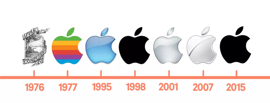
It is hard to find Who isn’t familiar with the logo! It is a very simple image of an apple that has been bitten. But the symbolism of this logo is perhaps not as simple as it looks. Besides many myths, there are quite a few real theories regarding the symbolism of that amazing logo.
The current Apple logo is the modern and evolved version. The very first logo of Apple had the image of Sir Issac Newton sitting under an apple tree. While the second logo (rainbow Apple) was derived from Sir Issac Newton’s prism work. Some people also like to believe that the logo indirectly symbolizes the forbidden fruit of Adam and Eve.
It is depicting lust and knowledge. Well maybe not literally perhaps, but Apple products are (sinfully) addictive. Hence the symbolism feels right in some corner for the middle-class buddies. There is also some myth about the bite in the logo.
Some refer to the computing term 8 bytes or binary knowledge. Although designer, Rob Janoff disagrees with these myth theories. Actually, the bite is to clarify that it is an apple, not a cherry. Simple!
Sony Vaio
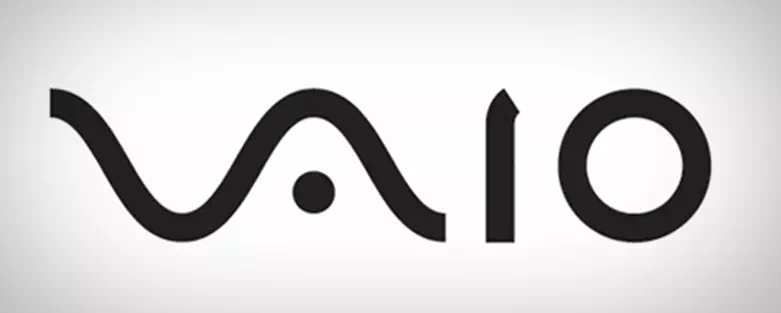
At first, we had no idea about the hidden meaning of this logo. Then we find out that the curvy V and A actually indicate the Analog wave or a signal. The I and O represent the binary code digits 1 and 0. Worth exploring the idea. Very unique, creative fitting for this type of wonderful company!
Milwaukee Brewers
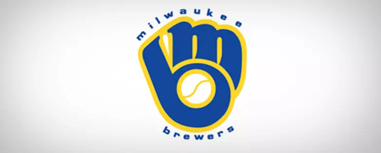
Are you a huge fan of baseball? If so, then you can recognize this logo and its hidden meaning. The Milwaukee Brewers logo is designed as a baseball glove holding a baseball. Wait, this is not the end. Go get a closer look. you may see a B and M in it?
Atlanta Falcons
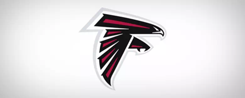
Let’s talk about sports again. The logo of the company Atlanta Falcons is easily and amazingly recognizable. The beak and claw indicate the falcon that is reaching out. Now the most interesting part. can you see what it actually creates? The letter F. Amazing!
Amazon.Com
Most people have now used Amazon.com. The logo is uniquely self-explanatory. The text spells out the name of the company. And the arrow under the A and Z is more interesting. It’s Amazon’s way of saying that they carry everything from “A to Z.”. That also creates a smiling face.
Unilever
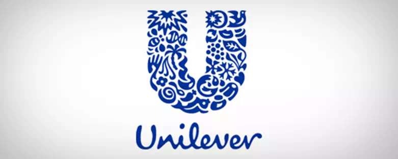
We saved the most intricate one for the last! The logo of Unilever is composed of 26 different icons. Each of these represents one of their products and their services. For example, one would be a palm tree. It represents nature and products that have coconuts, dates, palm oil, etc.
Gillette

This logo is a precious one. To demonstrate the precision of their all product, can you imagine what have they done? This razor company has decided to cut the tips of the letters “g” and “i” in the logo. As if an actual razor could have done it.
Pittsburgh Zoo & Aquarium
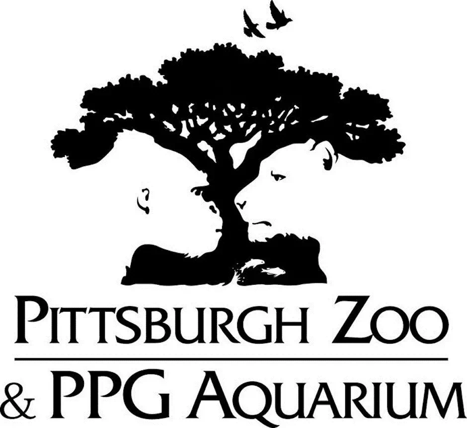
Give a closer look at the negative space on either side of the tree in this logo. With just giving a little bit of focus. You should be able to see a giant gorilla on the left and a ferocious lion on the right. Really amazing job.
Adidas
Have you ever wondered what those three stripes in the Adidas logo actually meant? Well, the reason for putting this in their logo is because together they represent a mountain. Thereby it is also symbolizing the hardship and the challenges that customers must strive to overcome every day.
“There were a lot of different colors and iterations [in the Google logo]”, said Ruth Kedar. He is the graphic designer behind the main original logo. “At first we ended up with the primary colors, but instead of having the actual pattern go in the order, we put a secondary colorwork on the logo. These things brought back the idea that Google doesn’t even follow the rules.”
Audi
There are actually four sub-companies in them. The four circles that comprise the Audi logo also actually represent the four companies that made up Auto-Union Consortium in 1932: DKW, Horch, Wanderer, and Audi. This combination is very much worth remembering for all of us.
Domino’s
When Domino’s was first opened. The founders didn’t expect the pizza chain to get as big as it did. So they intended to add a single dot to the dominos in the logo whenever a new location opened. But they never knew they will do such big.
However, the company grew very quickly too big to do such a thing. And they decided to stop in those three dots. So today the three dots in the logo actually represent the three original locations.
Logo Design Mistakes
Big companies make their logos a big effort. They spent a big amount of money to make a logo design for them. After all those efforts there happened some mistakes and faults in those famous logos. Let’s find out those faults these wonderful logos have.
Pepsi
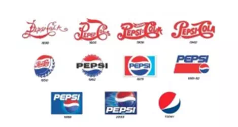
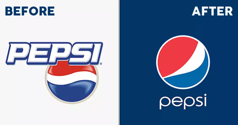
The red, white, and blue globe of Pepsi Company are easily one of the most recognizable logos in the world. But unlike the rival company, Coca-Cola, the Pepsi logo has also undergone several drastic changes through the years.
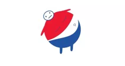
If you give a small circle on the top of the logo and also some stubby arms and legs. You’ll see a morbidly obese man. He is about to fall.
Surgery drinks, Including Pepsi, are known to cause obesity and this fact makes this even more interesting. This leads to the logo, it is delivering the wrong message to its customers. Something along the line of the company they are promoting obesity.
To be fair to the brand Pepsi though. They did launch several ad campaigns against obesity. So, the logo which is depicting a fat man is just a plain coincidence.
Google:
Google is always known for its simple yet effective approaches. Their many products have proved it. Their logos, including the latest one, also follow these principles strictly.
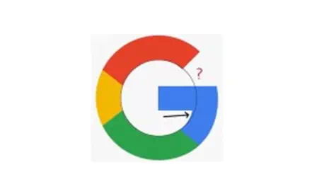
As it may be simple, the internet users were able to find a fault in the new logo. For one, the letter “G” in Google doesn’t get a perfect circle inside it.
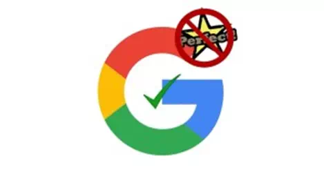
As a response to these naysayers, Google also admitted that the logo design revision is indeed not perfect. But they stated that they don’t want to follow certain geometric rules. Because they want to be unconventional. It is a trait that sets them apart and unique from the other companies.
However, this explanation did not go well with the geometric perfectionists worldwide.
Reebok

After being bought out by Adidas, Reebok disappointed its customers. Another reason for disappointment is subsequently changing their logo. They went from professional athletics and set out to the cross-fit audience with a real unwearable logo. The new logo carries a Delta symbol which looks more suitable for the banks rather than a sports company. Customers also forgot that there was an old Reebok logo that resembled Nike and Adidas.
Wikipedia
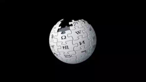

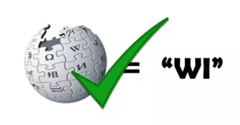
The logo of Wikipedia is ingenious. Specifically, the Chinese character. That doesn’t represent the syllable ”WI”. As it is a minor stroke in the character but actually it made an entirely different meaning. While they did fix it on the later versions of this logo. But the correct version was also got incorrect because the character represents the syllable “Jie” in Chinese and not “Wi”.
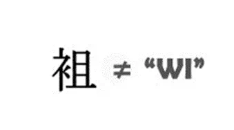
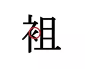
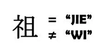
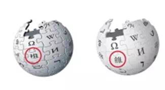
Currently, Wikipedia’s newest logo does not contain the wrong character anymore. It has been replaced by another character.
White House:
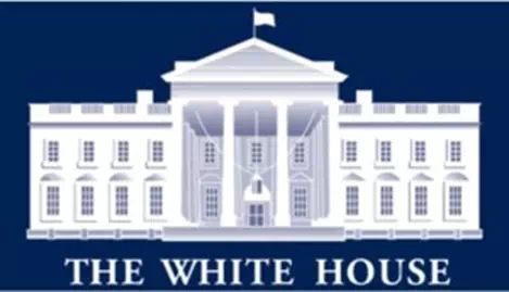
As the white house is the official residence of the incumbent president of the United States. A person would think that the logo would represent the most iconic building accurately. Well, it didn’t.
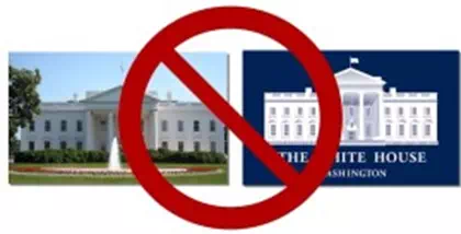
In fact, there are several mistakes and inconsistencies within the logo of The White House. First, give a closer look, can you find some mistakes?
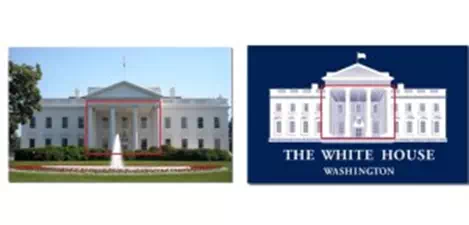
Actually, it’s not entirely noticeable, but if you look at the middle set of the windows. You would find that the one has a pyramid on the right on top of it. whereas the real one has an arch over it.
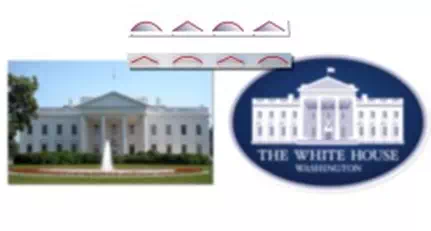
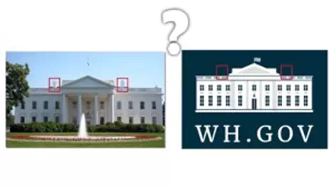
They may fix this minor error later on, but it introduced us to even more glaring mistakes. the right set of the windows now has got the pyramid and the archtops placed in the wrong order. The current logo, however, fixed all of these mentioned errors. As they opted for a very simpler look instead. Again we wonder what happens with the small pillars on both sides? Huh!
London Olympics 2012:
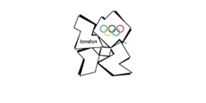
It is considered by many as the worst Olympic games logo ever due to its numerous blunders. To Start off, its design which looks like something from the ’90s. And while this is may not a bad thing. But a more modern look would have definitely been preferable.
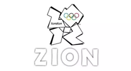

People should have seen this logo as 2-0-1-2. But the Iranians who participate in the annual games saw the letters “Z-I-O-N” in it. They deemed it a racist. This almost led them to back out from the competition. Though the Olympic officials stepped in and clarified the issue. Nevertheless, the entire game was successful and now it becomes a past.
7-Eleven:
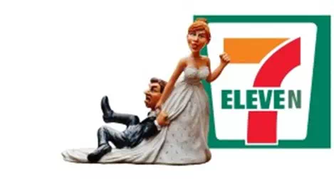
However, people say that this logo is far from perfect due to one thing. The letter “n”. Because it is in the word “eleven” in a lowercase. Whilst it is obviously international, no one knows the main reason and the origin of this flow in the logo.
Some say that it is the owner’s wife who decides to make the letter “n” lowercase and all the rest in uppercase. As it makes the logo look a bit graceful. While other people think that there is a linguistic history behind it. It is a hoax now also.
WWE:
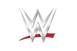
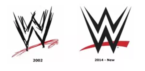
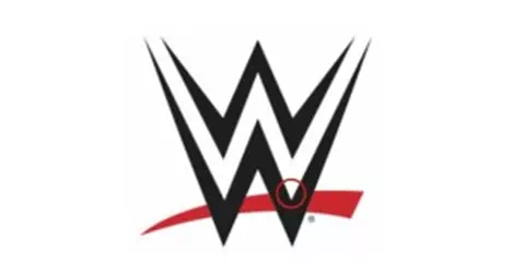
The new logo of WWE adopted a very cleaner and more stylish look. It is abandoning the scratchy appearance of the former design of the logo. But this transition came with a little flaw that upset some die-hard wrestling fans. It is a small nick in the bottom “W”.
While it may not something that would make someone scream in anger like Hulk Hogan. It can be a little bit uncomfortable to look at. Especially if you’re a nit-picky of the art major student.
But sadly true, for a multi-million dollar company like WWE, it’s quite unacceptable for a logo design to have such a glaring error. Ultimately it became their choice to keep the remnant out of the logo design.
Many fans of WWE presented some possible fixes for the logo design, such as moving the red swoosh part from the logo a bit lower. Or, making the nick totally disappear.
Despite all these suggestions, WWE company still went with its logo design.
Monster:
This logo it depicting a massive claw mark from a presumably monstrous creature. You also need to know that the Monster Company means a business company. However, to some people, it might also mean something else. Something sinister about it.
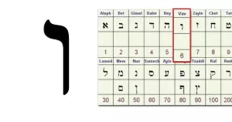
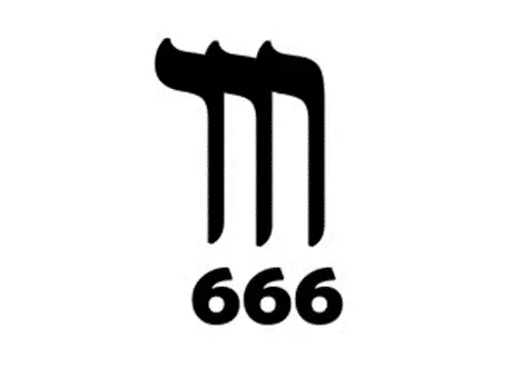
According to some religious and conscious people, the marks of the claw aren’t just so simple as that. Rather, they may represent the Hebrew letter “v” or “vav”. It is the sixth letter in the Hebrew Gematria. Now if you replace the 3 claw marks with the number “6” it turns the logo into “666”, and it is also known as the mark of the beast.
Walt Disney:
With the Donning playful swirls and a cutesy appearance, the Walt Disney logo design has become somewhat iconic for the children and children-at-heart. Initially, we noticed it to be Walt Disney’s signature that was actually designed by one of the insiders. A Walts’s own staff members do this job.
So it’s quite understandable why a lot of people think that it’s a huge mistake not to have used the founder’s own signature in the logo. But, other people also recognized something else. They found a fatal and intentional error within the logo design. Some people also intrigued him as a conspiracy theory.
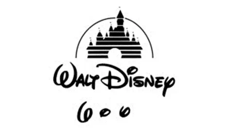
The swirls in the letters “W”, “I”, and “Y” all individually form the number “6”. That means a 666. And we all know what that means. A mark of the beast.
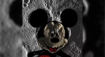
Is Disney secretly an evil corporation? No one really knows it for sure. Let’s just hope that crater on this Mercury is not Micky Mouse. But that looks awfully similar to the well-known Micky mouse. We can’t say anything for sure. But isn’t that mean this their secret liar?
Nintendo Switch:

We know Nintendo mostly for its innovative gaming console and also for the lovable characters it created. So when their brand new console came on the market, the Nintendo Switch, which was announced back in 2016. It received overwhelmingly positive responses all around the world.
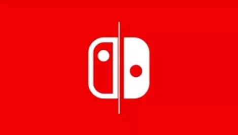
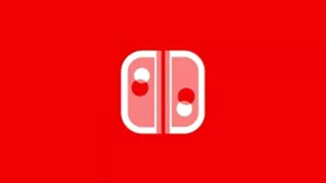
While most people were really getting excited to get their hands on the latest products. On the other hand, some people noticed another thing. The non-symmetrical logo design of the Nintendo Switch brand. While it’s really hard to notice at the first time of sight, it is indeed not an asymmetrical shape.
The logo is off-center like and also the logo’s left side is slightly larger than the right side of the logo. If you look again you may find the buttons are also a bit off. Again the button situated on the right side is slightly higher than it should be.
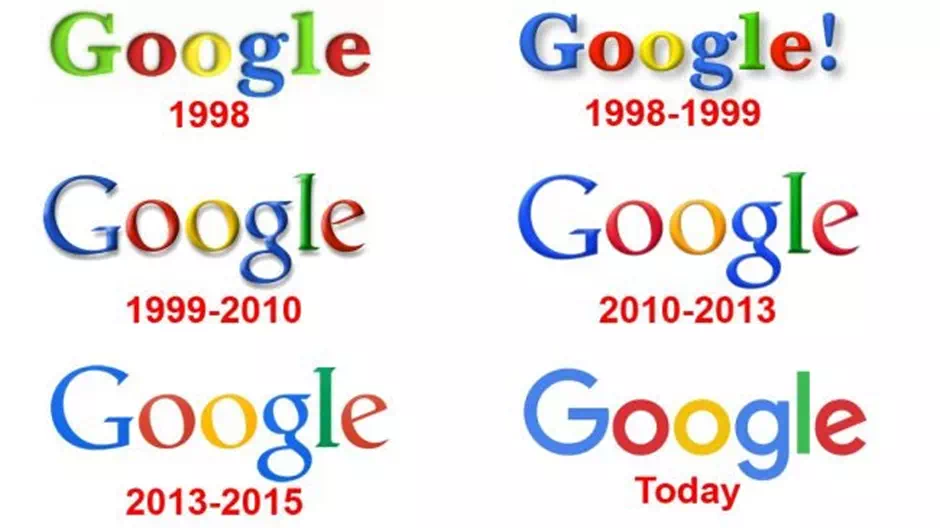
In the first hand, Google used an exclamation mark in its logo design. This made it look quite a little bit similar to its sole competitor Yahoo. In fact, this mischief was done when Google and Yahoo were in a big fight to gain market share. However, then in 1999, the logo changed its design again to reach its current victorious glory.
Gap
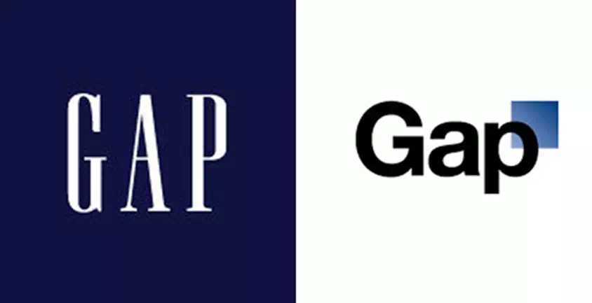
The renounced company GAP suddenly changed its logo to make it super simple and difficult to memorize. Then, when the company realized that the change wasn’t worthy and it is making the necessary impact disgraceful. So, it took a whopping 100 million dollars to bring the old logo design back to make the thing impactful and bold again.
Marriott Hotels
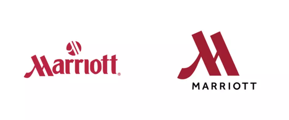
If you spent a quite big amount of money to get no change at all in the design for your logo. Then we can consider you a fool. The old Marriott logo was fully repetitive and took space. So what was necessary of it. It has got a similar design pushed to it and repeated as along. Then as an initial.
Luckily, they realized their mistake in the early span and changed it back. They again keep it in a normal letter with a decent size. They also pushed the smart logo in front.
NASA
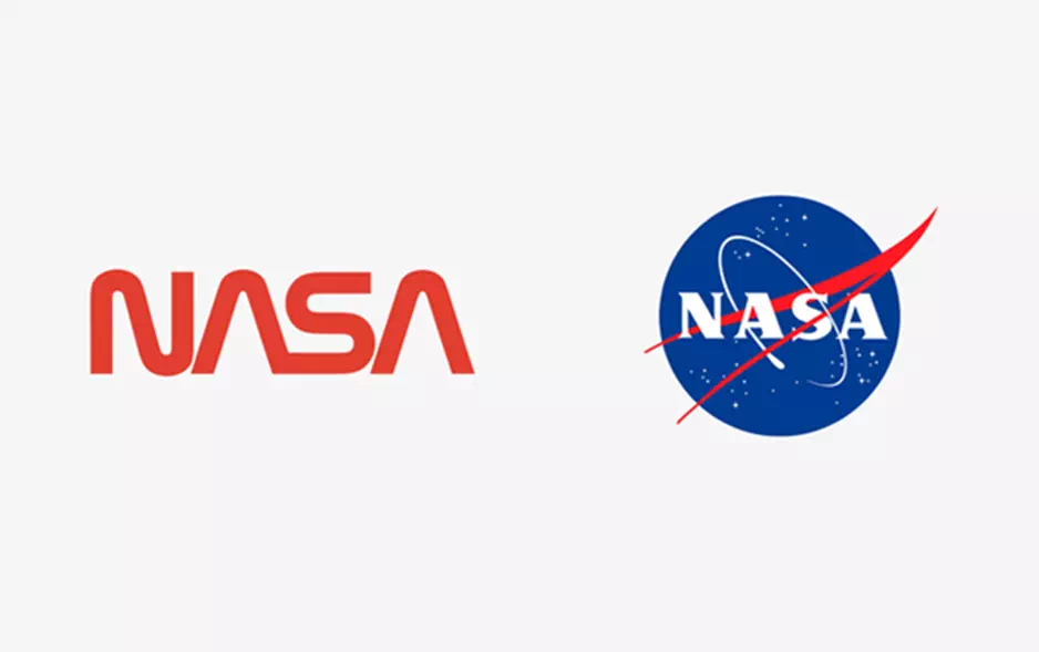
We didn’t want to put NASA in this serial. NASA has a standard record before of having amazing logos which are appreciated by brands worldwide. Yet, there was a time when all the basic red-lettered logo was called boring. It was also not related to science.
The term that defines NASA. Hence, it finally got back the realistic logical logo with its infamous meatball logo design.
Starbucks
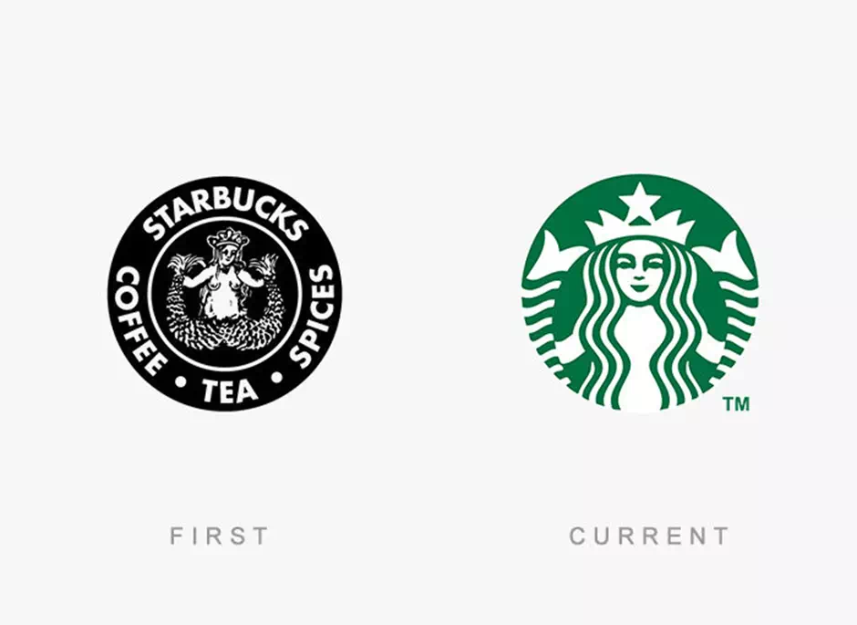
The earlier logo that was released in 2008 got a lot of complaints from many religious bodies. It’s because of the famous Siren in the logo which was kept completely visible yet naked. That was not a good move for them. And well, Starbucks is a favorite place for teens and kids.
So they need to realize the matter. Hence, in 2011, the famous one with the green textless. This time it is a half-siren logo that shines to date. Perhaps it is a very famous one.
Oxford dictionary

When Oxford changed its Logo it became a disaster. They made something that resembles the Beats by Dre logo. This logo design was invited by more criticism than praise. Really Sad. But after being a sole leader in the education industry. We can’t expect such mistakes from them and it wasn’t also appreciated.
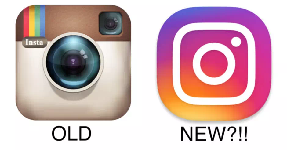
When Facebook purchased Instagram, it made a move. The logo of Instagram was suddenly changed. Instagram’s old logo was with a cool vintage camera. But it was changed to a brightly shaded and colored square. Now it hinted at a camera but not cool like the previous one.
Everyone was very disappointed with this change. But then again, they didn’t change it. It has remained the same and honestly speaking, people got used to the new one.
Animal planet

Like the name suggests here. The channel earlier had an amazing logo with a globe and an elephant. It was pretty perfect actually. However, a few years back, they decided to make a change. They decided to remove all the designs and made a new one.
Then they come up with a back-printed alphabet logo, not so special. just in a different font actually. Sadly, all can get that it has remained the same.
Messages
In the famous logos, there are a lot of hidden messages. Here You’ll find the most amazing hidden messages in the famous logos.
Adidas

Adidas has always got this simple three-stripe logo which is amazingly known and famous. This wonderful work was first created in 1976. Back then, the three stripes of Adidas were just three stripes. They didn’t have got much meaning behind them. The brand just wanted something unique which would look nice on a shoe.
In the early ’90s, the logo was tweaked further ahead. The three stripes were turned diagonally on their side and they try to create the shape of a mountain peak. The new design kept the basic form and idea of the original logo. It is also a purpose for those three stripes. Now it represents the struggle athletes must endure achieving greatness.
Amazon

Everything from A to Z. Most people could see a smiling face in the logo of Amazon at the first glance. They have used it since early 2000. It is associated with happiness and as well as giving it a positive connotation to the brand image.
But that smiling face is doing much more than that. It is giving the audience a very emotional cue. It’s also delivering a subliminal message to the audience.
The smile itself is in the shape of an arrow that points from the letter “A” at the beginning of the word “Amazon” to the letter “Z” in the middle. This is to signify to the audience that Amazon sells “everything from A to Z.”
Apple

What about the bite?
Some people notice that the “bite” in the Apple logo is a pun on the word “byte” (as in gigabyte, or megabyte for us rookies). Some others considered it as a metaphor for the bite of knowledge of the tree. Those are some of the messages the consumers get from using Apple’s products.
Either way, we think that it’s pretty awesome to add some interest in that kind of minimalistic logo.
So now what can we learn from Apple’s logo design? It’s very important to notice how the logo design displays the traits of its products in such a superb way. Their logo completely matches the personality of the brand image.
When we think of some of Apple’s products, our minds made us remember some words like accessible, sleek, and intelligent. The logo conveys just that image and brand value.
BMW
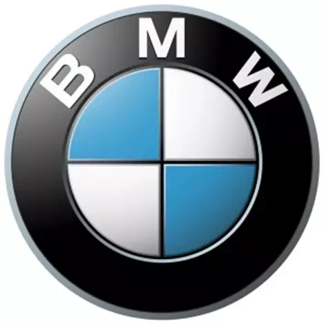
The German car company called BMW was once well known for creating more amazing products than automobiles. They also created amazing aircraft engines. This thing has led many people to believe that the blue and white checkered logo design is to signify a big plane’s white propeller with an amazing blue sky behind it.
While their work of that time makes for a great branding in today’s time. But this was not the original intention for making such a design.
Back in those days, the BMW company wanted to use the colors of the Bavarian Free State in the logo design. But that was illegal at that time. So, they try to reverse the colors and guess what. They accidentally created this propeller design.
DC Comics
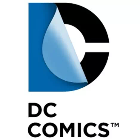
When movies that were based on comic books began to become huge box-office blockbusters, DC Comics decided to update the old logo design. It was to represent the entirety of the media group they create. And it was to show that the full things expanded with the hand of those comics.
Domino’s Pizza
Everybody maybe knows about the Domino’s Pizza logo which is based on a domino playing piece. it’s quite right because there is something like that in the name, after all. But what you might not notice is that there’s a message hide in it to be learned from the Domino’s Pizza logo design. It is quite like “Avoid the Noid.”
Again, there are the three dots. These dots in such a corporate logo represent the origin history of the Domino’s Pizza restaurant.
FedEx
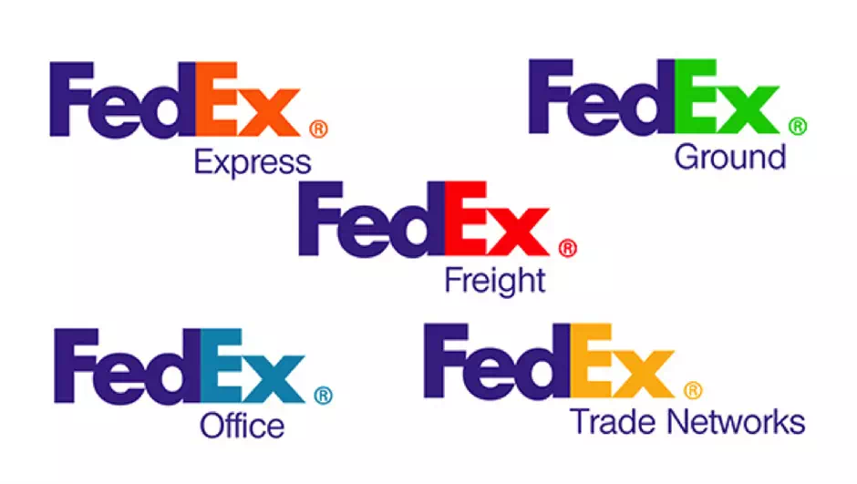
There are many hidden secrets in the logo design of this company. And as well as there is some message hidden in it. It was in the full corporative site you have to look for.
The color-changing in the font is another thing that we can learn from the design of the FedEx logo. Look at intelligent color psychology and see how you can weave those multiple colors for multiple products you get into your logo design.
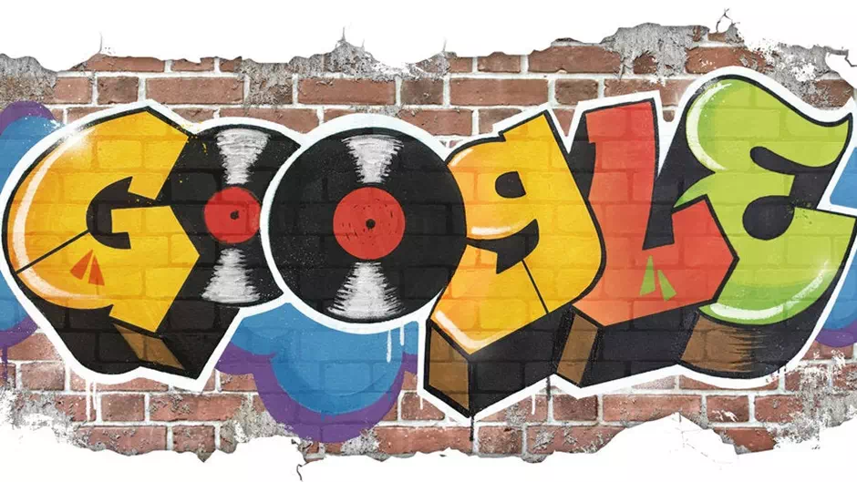
Just like Google, you can have a message from its new work. You can consider updating your logo design to reflect local or world events. The branding in the locality around the world is quite amazing. It creates a new hype in the brand new design of Google as well as in the world of logo design.
IB’M
Equality for all
The IBM logo is depicted in a big serif font with horizontal lines init. It also bases on whitespace running through the design and breaking the logo up. The reason behind the horizontal lines is due to the fact of the early photocopies machines. They had real difficulties reproducing such large blocks of the solid ink.
The current logo also bears some small secret messages created by many of these horizontal line breaks. The bottom right corner of this logo design is broken up. And it is in such a way that the serif fonts on the bottom of the “M” display something logical and worthy thing. It is an equal sign that represents the value of equality.
McDonald’s
‘The golden mammaries’
In the logo, we can find an amazing thing to notice. It is about the “M” shape of this design. That “M” shape also got a risqué hidden meaning. It represents a pair of breasts of a mammal. It is also a symbol of nourishment for us mammals.
NBC
‘Proud as a peacock’
We already mentioned the main thing. It is totally about the proud and the message is also about their proud activities. They made this event for the new outcome of the color TV. It also indicates the beauty of the new world’s peace.
Paramount Pictures
‘A star-studded mountain’
The Paramount Pictures logo was created by William Wadsworth Hodkinson, the founder of this business. Legend says that he sketched the logo design on a napkin. And the mountain peak is called Ben Lomond Mountain.
Now, what about the 24 stars. We can find the original logo surrounded by 24 stars. It is representing the 24 actors and actresses of that time that were signed for the studio. It represented 24 movie stars literally.
Pepsi
‘The smiling globe’
The Pepsi logo is officially known as the “Pepsi Globe”. It was created in the 1940s during World War II. You can not imagine what was the main purpose of this logo. It was about Patriotism. The patriotic red color, white color, and blue colors were chosen to show support to the battle troops overseas.

The logo is a task of amazement. This “P” that is pin-shaped is used throughout the rest of Pinterest’s branding image. It also got its social buttons in it. It represents the phrase “pin it.” It also seeks the attention of media very frequently that can be pinned to a Pinterest board brand. All these hidden pins are designed to get people’s attention. It is about pinning things by mimicking the reversive action of pushing a real pin into the bulletin board.
Starbucks
‘The salty siren’
There are many myths and some facts about the logo. For the first time, the naked siren is bothering some customers. It represents the temptation that cannot be controlled to have this product. Pretty interesting, isn’t that? Later they tricked with the siren but it remains the same tempting with the product value.
Toblerone
‘The bear in the mountain’
The Swiss chocolatier guys at Toblerone are known for their unique triangle-shaped chocolate bars. The logo is featuring a picture of the Matterhorn. It is also symbolizing the product’s origin and country. The bear represents the brand value and hype for this product.
Toyota
‘The heart of hidden symbols’
The Toyota logo is overloaded with hidden messages. The big letter “T” has a very wonderful meaning. In the logo, we can also obviously find a big letter “T” for Toyota. The automobile manufacturer’s logo design is composed of overlapping ovals. It represents the intersection of their customers and the company’s heart. Even there is a space behind the logo design which signifies the boundless opportunities the future will bring.
After getting all that meaning, you can think there’d be no room left for more symbolism. If you are thinking so, then you are wrong. Look carefully at the three circles ii got. You’ll find every single letter from the word “Toyota” hidden inside it.

Vaio

‘Old-school meets new-school’
Sony is a well-known company with a good history of making quality audio and video equipment. So, when they created the brand Sony Vaio to sell computers, laptops, and tablets. They made a new logo. They chose a kind of logo that represents their past and reaches toward the near future.
Wendy’s
‘The pigtailed girl grows up
This is a wonderful logo with a very amazing message. It shows homage to all the respected mothers out there. They also signify their struggle and the love of a mother cooking. The hidden image also depicts the word, MOM.
LG
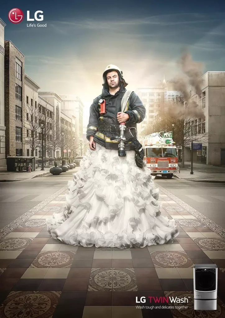
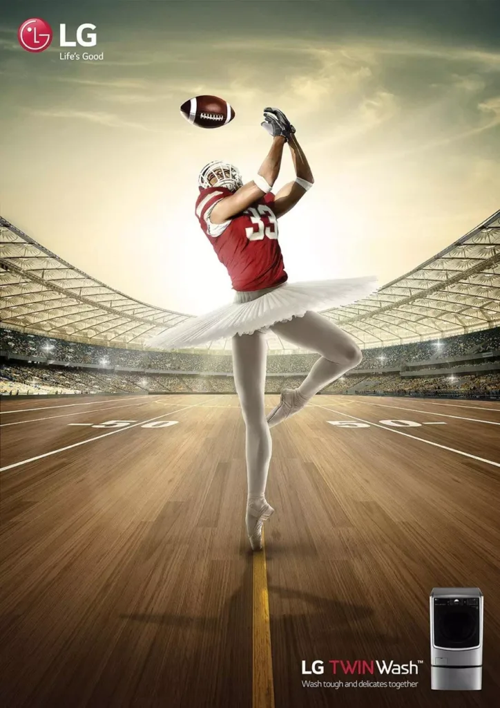
The logo of LG is an inspiration for the people. It shows the best version of the person in the eye himself. It also tells that If you can unlock the creativity inside yourself then you can do something amazing. It reflects a person’s power of happiness.
Mercedes-Benz
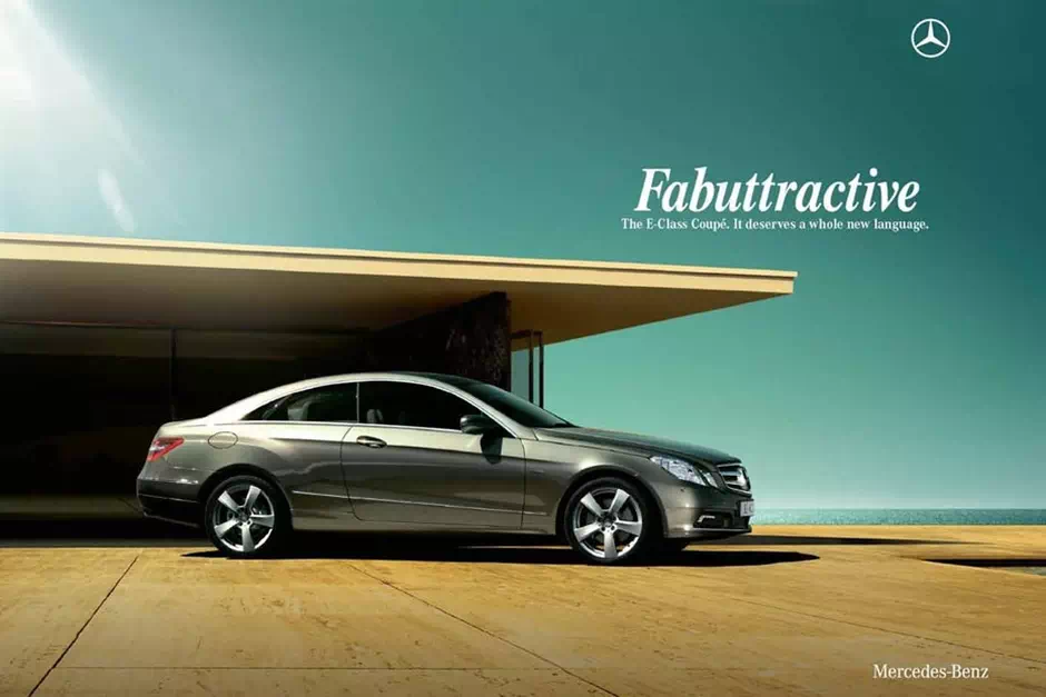
The logo of this company is simply representing the aristocracy. But they are also concerned about global peace which is subjugated in the design of their logo. It creates a loving shape of peace throughout the world. They mean it.
Coca-Cola
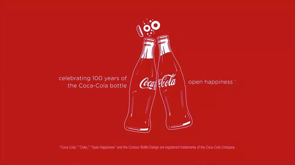
Coca-cola is reflecting uniqueness. It hidden message on the board also signifies that people are unique and they will become more unique with their products. When a person is in trouble it can refresh the mind of that person. That means it can create sole creativity with refreshment.
Nike

One of the most prominent messages we can get from the Nike logo is how to convey the attributes through the shape. The swoosh evokes the brand’s logo’s motion with speed. It boosts the mission and creates a goal for the users. It is very interesting.
All the logos are practically enshrined by the people of our society. Yet they were designed by some ordinary people. Many people call them the designers. Unlike simple art, the logo is also another piece of graphic art. But this graphic art needs a lot of hard work and creativity. In the above, we mentioned the faults, secrets, and messages in those logos. All these logos are amazing and worth appreciation. We hope you like our initiatives.


