The Business and Consulting industry is never out of the place rather it is growing day by day. If you are planning on starting your own, you must think of designing an outstanding logo in the first place. So you are in the right place to get an awesome consulting and business logo design idea.
A well-designed logo that will represent the company’s values and spread its good vibes is every company’s desire. There are many techniques and ideas that you may need for creating that exclusive logo for your consulting group.
Need ideas? Go through our list of 25 Best Consulting and Business Logo Design Ideas with tips.
Image Credit: Looka and Brandcrowd
PA Consulting group:
The logo of PA Consulting Group is a typography-based design. The designer has used two different fonts for the logo. As the company name requires more attention than the rest, it is more striking and bigger. It is a good trick for making the logo attractive and effective. The designer also used two different colors in the logo along with the fonts. Such techniques help a lot in making any consulting group logo even more appealing and eye-catching.
Start-Up Business Consultant:
You can bring novelty and creativity to your logo design through some minimal efforts. For instance, the logo of the Start-Up Business Consultant has used a little illustration in the design along with the typography. It gives the logo that exclusive look that makes the logo successful and effective. There are a lot more different ways you can change the boring outlook of the logo. Choose the one that fits your company motivations the best.
The Simplicity Solution:
The logo of The Simplicity Solution is a perfect example of minimal design. Besides the typography, the little illustration has made the logo concept clearer and straighter. Brainstorm on different designs and ideas and try to figure out the best way will define the company motto and inspirations positively. Let the people have a great first impression through the logo design.
Related Post
• Accounting & Finance Logo Design Ideas
• Animal & Pet Logo Design Ideas
• 25 Bakery Logo Design Ideas
Campbell- Balcombe:
The logo of The Simplicity Solution is a perfect example of minimal design. Besides the typography, the little illustration has made the logo concept clearer and straighter. Brainstorm on different designs and ideas and figure out the best way that will define the company motto and inspiration. Let the people have a great first impression through the logo conversion and design.
Gwadar Advance:
The logo of Gwadar Advance is another great example of typography-based logo design ideas. The designer has used two font sizes to put more emphasis on the company name. There is a little illustration in the logo to make the perspectives of the logo clearer and more interpretable. If you intend to use any illustration in your logo design, make sure it represents the company and its activities properly.
Bain & Company:
There are so many ways you can use typography in your logos and make them exclusive for your company. You can bring uniqueness and authenticity by adding small details to it. For example, the logo of Bain & Company has used a little symbol in the logo that has given it an extra charm. This way, the logo becomes attractive well as it serves the purposes perfectly.
Santander: business logo design ideas
The logo of Santander shows the way of making any logo a lot more beautiful and appealing with a regular and familiar font. Instead of choosing a fancy font, they have used a basic font in their logo design. But that does not give the logo any less beauty and elegance. So, if a minimal design is your thing, you can take inspiration from this example.
Northshore Contracting:
A meaningful illustration can turn any simple logo into a way more fascinating and thriving one. It even helps people to understand and remember the logo as well. The logo of Northshore Contracting has set the example quite perfectly. They have an anchor symbol in the logo that resembles the Northshore concept perfectly. Such techniques are great for designing business and consulting logos as you need people to trust the company.
Barclays:
You can use bird illustrations in your business and consulting logos to show the company’s inner spirit and strength. It makes the company way more trustworthy and dependable. The logo of Barclays is a fine example of that technique. They have used an italic font to give it a better outlook. Also, the font is not too overwhelming that might eventually annoy people. Keep the design simple yet effective in the purposes and perspectives.
Hatched Consulting:
Here is a fun idea for making the logo design relatable with the Business and Consulting groups. The logo of Hatched Consulting has a half-broken eggshell representing the word ‘hatched’ in its design. Also, the illustration has a geometrical pattern that has made the logo more related to the company motives. So, if you want to create an exclusive logo with some fun features, go for this idea.
Elevator Hub:
You can bring a huge difference to the look of the logo by changing one of the letters creatively. The logo of elevator Hub has done the job quite successfully. The letter ‘V’ is changed and given a touch of elevating that relates to the company’s purposes. Also, it makes the logo a lot more stunning and memorable. Besides, the designer has used two colors that have added more elegance to the logo design.
Pyramid:
Business and consulting logos require a minimal and straight design with the right perspectives so that people can relate to them. Sometimes the name of the company can give you the idea of the design that will fit the logo perfectly. The logo of Pyramid has an abstract pyramid design along with a soft-rounded fancy font. Both of them have contributed greatly to the beauty of the logo.
Optimy:
When you want people to focus on the company name only and give them a clear idea of what’s going on, this is the ideal example for that. With the typography, you can create great designs through slight changes. For example, the logo of Optimy has a different looking ‘O’ that represents the company’s secret message. It also has two shades of colors that have added another layer of charm to the logo design.
Global Compass Consulting:
The logo of Global Compass Consulting is a brilliant example of using meaningful pictures in the logo design. The designer very cleverly used the both ‘global’ and ‘compass’ concept in one abstract image. It makes the logo more eye-catching and memorable. The one shade of color has prevented the logo from being overdone with the design. If you want to create a logo following this technique, keep it as simple as possible. Otherwise, the ‘overdo’ will hamper the logo purposes.
Oliver Wyman:
The logo of Oliver Wyman is a classic black and white logo with a slight geometric illustration. The illustration gives a hint of the infinity sign that relates to their company motto and perspective. Such tiny and minor designs make the logo more impressive and catchier. If you can deliver the right message through your logo, it makes a great first impression for the clients. So never give up on that.
Lacier Business Consulting:
At the first glimpse, you may not find anything interesting in this logo. Yet you cannot deny its elegance with that little bold and gothic font. Also, the color has played another great role in the logo design. The effort is minimal but the outcome is not. So if your goal is to make a logo with a little effort, here you go. Choose an attractive font and creatively put together everything.
Falcon Project Consultants:
Using a triangle shape in the logo design makes it more powerful and reliable to the eyes. The logo of Falcon Project Consulting has used this shape to present their inner motivations and strength. Such design makes the logo stand apart from competitors and creates a positive vibe. So, for achieving logo purposes to its full extent, you can choose such designs for your business and consulting group.
Wave Consulting:
There are many ways you can use triangle shape and here is another example of that. The logo of Wave Consulting has used the shape with a little bit of change that has made the design more relatable with the company name. The designer has kept the color blue with different shades making it related to the word ‘Wave’. Also, the eye-soothing font choice has given the logo a new height. Such little tricks can make your business and consulting logo far more superior and attractive.
Digital Guide:
As a business and consulting group, you need people to rely on and trust your services. A logo can help you greatly in this process. That is why you need striking colors and designs that will attract their eyes. The logo of the Digital guide is a combination of typography and illustration. The illustration is nothing but a unit of the letter ‘D’ and ‘G’ in an abstract form. So the clients need to wait a bit and interpret the design mindfully.
Arrows Consulting:
An abstract pattern can make your business and consulting company logo more elegant and relatable. But that particular pattern has to be meaningful and authentic. So if your goal is to create a logo that will be memorable and impressive, go for abstract patterns. To make it purposeful, try to bring out the most striking feature of your company and show it through the design. This way the clients will know your services better.
Skulk Consulting:
The logo of Skulk Consulting has an abstract animal pattern as an illustration in the logo design. The image perfectly resembles the name making the logo more trustworthy and fitting. There are many ways you can use an animal pattern to show the company’s purposes and goals. And the abstract pattern makes it more thrilling and captivating. You can even go for something symbolic instead of going for literals.
Thinkaroo:
The logo of Thinkaroo is as fascinating as its name. The name suggests two different things and so does the logo. The light bulb has a kangaroo image in it making the logo exclusive and unique for the consulting company. Such designs attract people’s eyes and make them spend some time on them. Thus a successful logo serves its purposes and brings benefits for the company.
Lion Consulting:
Here is another great example of using the animal pattern in logo designs. And it is also an abstract one. The logo of Lion consulting has used an abstract crowned lion-head to glorify the company’s strength and services. The eye-soothing and warm blue tone have given the logo an uplifting vibe. The design is not much elaborate but still, it is captivating and inspiring. For your business and consulting logos you can experiment on such logotypes.
E. Consulting:
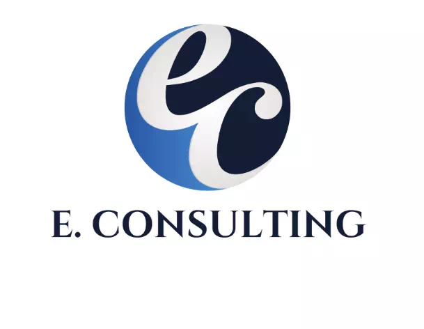
If you like an emblem style in logo design, here is a sample logo for your good. The E. Consulting has used an emblem style in its logo design. It looks attractive as well as grand thanks to its catchy pattern and colors. Another great advance of this style is that it fits every type of company logo. So, there are few chances of going wrong with the style.
Summits Consulting:
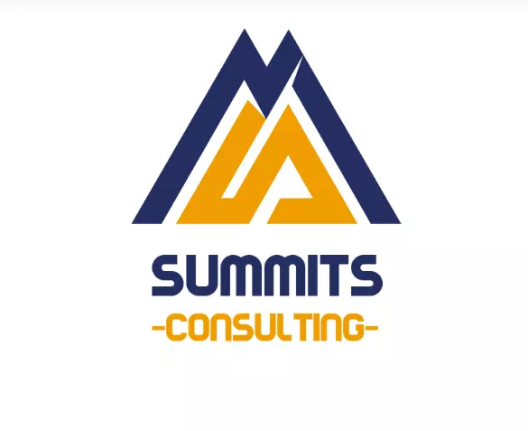
Last but not least- the logo of Summit Consulting gives you a good inspiration for creating creative logos with minimal effort. Can you find ‘S’ and ‘M’ in the triangle shape? These little efforts give the logo an exclusive look that brings appreciation and acknowledgment for the company itself. For your business and consulting logos you can follow these techniques along with putting your company purposes and objectives.
So now you have the best ideas you may need while designing your company logo. Along with your designing skills and creative thoughts, you can create the most amazing logo for your business and consulting company. It will take your start-up to the next level.

