If you are about to open your new dental clinic, you must consider having a professional logo. Logos serves more than you expect. But it has to be well designed and thoughtful to do so. They help the clients to remember you and the business to grow sustainably. In this article, you will get a bunch of unique dental logo design ideas to inspire the new and professional designers.
Earlier, we covered creative logo design ideas, including many sectors like engineering, event, entertainment, and more. You are invited to go through the articles to have some more information.
Well! There is no point in making the logo boring or monotonous because they are dental logos. You can make the logo as interesting as you can through your creative ideas and designing skills. Also, there are different types of shapes and patterns that you can use to make the design more vibrant and professional.
Best Dental Logo Design Ideas for Beginners
A logo must tell your brand story. It must express the right message to the right target audience. Also, a great logo design must be simple enough to be easily remembered. Here you have a list of the 25 Best Dental Logo design ideas as references for inspiration.
Elwood Avenue Dental
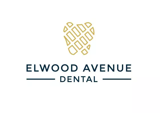
The logo of Elwood Avenue Dental is a combination design with an illustration and typography. The illustration is a teeth-shaped pattern with geometric-box shapes inside it. The design perfectly resembles dental clinics or orthodontic businesses. Also, the semi-bold font has made the design balanced as well as formal. If you want a minimal modern design for your dental clinic, it’s a great inspirational design for you.
Dominguez Family Dental
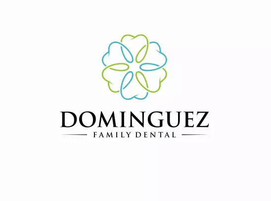
Dominguez Family Dental is another example of a combination logo design. The designer has created a floral design as an illustration with teeth patterns. The color combination is blue and green which is the most common and relevant color palate for dental logos. Along with that, the typography has brought another difference with the use of two font sizes. We must say, the design is a bit clever and ought to attract the eyes without any fail.
Pediatric Dentistry
Though blue and green color defines dental logos more vividly, you can still choose other colors to use creatively in your dental logos. If you need inspiration, the logo of Pediatric Dentistry is here for you. This design has got a vibrantly colorful teeth pattern that is not only aesthetic but also attention-grabbing. Such designs help you get clients as they represent liability and expertise.
Kirby Gate Dental
In case you don’t know, apples and teeth represent the dental logos more prominently as both of them are related to the dentistry business. Designers often use these shapes in the logo designs to define their purposes and perspectives. For instance, the logo of Kirby Gate Dental has combined illustration and typography together to present their mottos. Apple and tooth both of the shapes have been used here for good reasons. That has made the logo more meaningful and interpretable.
Platinum Dental
The logo of Platinum Dental is a line art design combined with typography. Line art refers to abstract lines in different shapes which is striking and bright against a background. It makes the logo clean, straight, and minimalistic. The sample logo here has a tooth shape made with line art. Also, the designer has used a customized font to match the illustration. Both of them have contributed n making the logo modern as well as smart.
The logo of Platinum Dental is a line art design combined with typography. Line art refers to abstract lines in different shapes which is striking and bright against a background. It makes the logo clean, straight, and minimalistic. The sample logo here has a tooth shape made with line art. Also, the designer has used a customized font to match the illustration. Both of them have contributed n making the logo modern as well as smart.
Happy Chompers

If you want a logo with positivity and good vibes, the logo of Happy Chompers can inspire you greatly. The designer has made a smiley face with a mouth and teeth representing the logo’s purposes and services. Also, the entire symbol is created in a form of the letter ‘H’. The bubbly font has given the logo more adorableness and charm. So, we recommend researching the logo’s perspective that you want to show through the design to bring a better result.
Mint Leaf Dentistry
The logo of Mint Leaf dentistry is an inspirational one for many reasons. First of all, the leaf illustration is created in a teeth shape so that it looks like a dental logo. Besides, the customized font has given the logo an exquisite look making it relatable and meaningful. We can’t ignore the fascinating look it has got because of the monochrome style. The leaf-green color has given it a refreshing and eye-soothing effect that is engaging as well as intriguing.
An Apple A Day
The logo of An Apple in a Day is as identical as the name suggests. It is a combination design that contains an illustration and typography. The illustration is the most striking part of the logo as it has the shape of both teeth and an apple. It perfectly resembles the dentistry name and makes the design more impressive. Also, the bright red color has given the logo a vibrant look that is not only attention-grabbing but also intriguing.
Dentora
The logo of Dentora is an elegant design that can be identified as a combination design. But the illustration used here is incredible for its mascot-like look. The designer has created a teeth shape with the hairline of a woman. Such logos make people stand a bit and appreciate the design. That is how you can say the logo is successful. These logos attract potential customers and make a positive impression at the first sight. So for your dental logo design, you can choose such an idea.
Confident Smiles
Now here is another wordmark dental logo design idea for your inspiration. The logo of Confident Smile is a wordmark logo with no illustration or symbols. Such logo designs are timeless, classy, and perfectly fit for dental clinics or dentistry. The sample logo has used a serif font with a shady blue color. The little curvy line has made a smiley effect that complements the design even more.
King Dental
The logo of King Dental can be your inspiration if you want to use two types of fonts in your dental logo. The sample logo has one bold font along with one regular serif font. Together they have made the dentistry name striking and more recognizable. So, before using two fonts in your logo design, see that they complement each other. Otherwise, the design may look disordered and misbalanced.
Dentic

The Logo of Dentic is one more wordmark design inspiration for you. This time you can see an emblem pattern as well. Such a combination makes the logo even more identical and worthy. Not only that, if you love a modern, minimal design, this example will serve you the best. The color palette used here is another incredible feature it has got. So this is how you can design your dental logo using multiple styles at a time.
Mdentist
Dental logos look better in minimal styles which are not entirely devoid of creativity. You can always turn a boring design into an interesting one through creative ideas and thoughtful designs. Anyway, the logo of the mdentist is an ideal example of experimental designs. The designer has made a rectangular shape to give the logo a more definite look. Once you add a new feature to the design, you can keep the rest of the parts simple to balance everything nicely.
Omega Dental
The logo of Omega Dental inspires you to experiment with monochrome style in logo designing. Colors indeed make the logo vibrant and dazzling. But monochrome or the use of one color brings a precise and straightforward look to the logo. It looks incredible on one side and the other side it is suitable for any type of logo. So, pick a color that will complement the design while making the logo attractive and effective.
AppleSeed Dental
Colors are the most powerful feature of a logo design. A misbalanced color combination can ruin all your efforts and make the logo dull. That is why picking the right color combination is necessary. You can use two-color combinations to five-color combinations for your logo design depending on the elements you are using in it. The sample logo here is of AppleSeed Dental which has a two-color combination design. The green-apple color along with the sky-blue has created a complementary relationship with each other
Tulip Dental Clinic
The logo of Tulip Dental Clinic is an ideal example for your cause if you want the logo a bit appealing and unique. Apart from all conventional logo designs, you can create something out of the box as the sample logo has done here. The designer has made a hand-drawn illustration of Tulip as it is in the clinic name. To make more sense as a dental logo, there is a teeth shape as well. This is not something that you will find in many logo designs and that is the notable part here.
Family Dental
The logo of Family Dental is an interesting design that can give you some inspirational ideas to create your dental logo. First of all, the designer has shown a perspective with the three love signs symbolizing a family. It makes sense as the logo is for a family dental clinic. Also, the color choice is another great part of the design. The black and blue combination has made the logo brilliant and professional.
Fuller Dental Practice
If you want to stand apart from common logo designs and make a statement design of your own, you must need something more to invest in. The logo of Fuller Dental Practice is an ideal example of creating a unique design. It has a brush whose bristles are replaced with different human shapes to suggest that it’s a center for all types of people. Such a logo makes the clients interested and curious. So, it is super effective to design the logo with meaningful perspectives.
Highlands Dental Lab
A fancy font changes the whole outlook of your dental logo. And when you choose a gorgeous font, you are half done with the design. Now all you want is to make the logo relatable with the dental theme. The logo of Highlands dental Lab is an ideal example of this idea. Here an illustration is also used with the typography to make the logo meaningful and sensible.
Ns Dental
The logo of Ns Dental is amazing for its brilliant color combination. The black is used against a lavender background and it helps the black to pop more. Apart from that, two dental tools have been kept here to present the logo’s purposes. The whole logo is looking super precise and minimal with these few elements. And that’s the point- you don’t always need elaborate designs for your dental logo.
A to Z Pediatric Dentistry
Mascot logos are great if you want the design to be outstanding as well as meaningful. You can easily show anything through a mascot and design it, also not difficult. The logo of A to Z Pediatric Dentistry is a dental clinic for kids and the logo is the proof of it. There is an elephant whose trunk has a little toothbrush in it. Besides, a gothic font has been used there to make the logo more adorable.
Shine

Using the toothbrush as an illustration is a great way to design a dental logo. It makes sense to all and looks absolutely relatable. The logo of Shine has a toothbrush head as an illustration along with its serif font. The color palette is also amazing as they perfectly complement each other. So before designing your dental logo, choose a meaningful element to use in it for representing your clinic’s perspectives and services.
Skygate Dental
The logo of Skygate Dental gives you another one of the prominent dental logo design ideas of using a suggestive illustration that makes the logo valid as well as impressive. That is why it is important to use it perfectly. The sample logo has used the illustration in the middle of the two words. You can use it wherever you want. But don’t just put it carelessly. It bears some amount of significance that where you have put it.
Thornhedge Dental Surgery
Thornheadge Dental Surgery is a modern design with minimal elements. The line art technique has given the logo a straight look which is inspirational and engaging. The line art is actually a teeth shape that looks like a heart. It suggests that the services they provide are full of care and love so that you can put your trust in them without concern. Our verdict is that- such designs make your dental logo way more trustworthy and precious.
Smiles
The logo of Smiles can be identified as a hand-drawn design with its sketchy look. Hand-drawn logos are super adorable and a great technique to attract the eyes of people. It gives personality and uniqueness to the logo design. Also, the font used here is bubbly and gothic which has taken the design to another level. The royal blue color has made the design pop up vibrantly and it is hard to ignore.
To Conclude- Creative Dental Logo Design Ideas
The logo design is the first thing that will be noticed by your customers when they see your business. A creative dental logo can help you gain new patients and attract attention from existing ones. In order to create a logo that will stand out from the crowd and make an impact, it is important to put some thought into your design. Hopefully, the ideas we shared in this post will help the designers to create unique and professional ones.

