The construction industry is already an established one and never loses its relevancy over time. In such an industry, as an entrepreneur, you may have hundreds of business and marketing strategies to grow your startup successfully. Creative construction logo should come first when it comes to priority. A good construction logo will help you to create the brand identity that you just need to compete with other established farms and companies. It helps you to convince the clients to take your services. So, you can feel the worth of it.
The logo is not only a combination of some symbols, colors, and fonts. They mean nothing if there is nothing sensible and relevant design there. That is why designing a logo is requires attention and a thoughtful process. But worry no more. Our list of 25 best construction logo design Ideas will show you amazing ideas along with tips and techniques holistically. Check it out.
What is a Construction logo?
A construction logo is a visual symbol or graphic emblem that represents a construction-related business or company. It serves as a key element of the company’s branding and marketing efforts. Modern construction company logos typically incorporate relevant elements such as tools, buildings or other construction-related symbols, and they often use specific colors and fonts that convey professionalism in the construction industry. A well-designed construction logo not only distinguishes a company from its competitors but also establishes trust and recognition within the industry and among potential clients
How to Create Best Construction Logo?
Creating the best construction logo is a vital step in building a strong brand identity for your construction business. Let’s explore essential tips and strategies to make best construction company logos.
- Define Your Brand Identity: Start by understanding your construction business’s unique identity, mission and values. This forms the foundation for your logo design.
- Research and Industry Alignment: Conduct market research to identify industry trends and competitor logos. Ensure your logo aligns with construction industry standards while standing out from the competition.
- Design Elements: Choose a suitable style, color palette, typography and relevant icon or symbol that represent your construction services and brand identity.
- Simplicity and Versatility: Keep your logo design simple, memorable, and versatile. It should work well in various sizes and formats, and adapt to different applications.
- Professionalism and Uniqueness: Strive for a professional and unique logo that conveys trustworthiness and sets your construction brand apart from others in the industry.
What to consider when designing a logo for Construction
Designing a logo for the construction industry requires careful thought and consideration. In this brief guide, we’ll outline key factors to keep in mind when crafting a construction logo that effectively represents your brand and resonates with your audience.
- Relevance: Incorporate construction-related elements like tools, buildings, or equipment for immediate industry recognition.
- Color Palette: Choose earthy tones or bold blues to convey stability, trust, and professionalism.
- Typography: Opt for clean and bold fonts that reflect professionalism and clarity.
- Simplicity: Keep the design clear and straightforward to enhance memorability and versatility.
- Uniqueness: Strive for a distinctive logo that stands out and sets your construction company apart from competitors.
25 Best Construction Logo Design Ideas
Embark on a journey through innovation and creativity with our showcase of the 25 unique construction logo design ideas. These construction logo design services are applicable for any construction company in the world, besides the company of USA.
Roof & Wall:
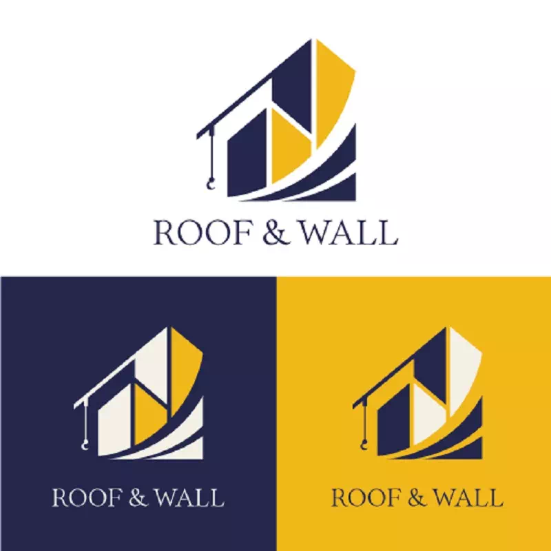
The logo of Roof & Wall is a combination design of letters and illustrations. To make the design relevant to the construction industry, the designer has used a building shape. Anyone can immediately recognize and interpret the logo’s purposes and what business it is representing by looking at the logo. The precise use of colors has given the logo an appealing look that is hard to ignore and forget.
Acorn Contracting:
The logo of Acorn Contracting claims to be an eco-friendly construction company and their logo bears a sign of it. The design quite resembles the eco-friendly concept with its green leaves which are actually acorn leaves. So they took it as their designing element to present the business motto and be unique about it. They also have a window shape to relate to the construction business.
Dexson Construction:
Abstract designs and patterns suit logo png format amazingly. It gives the logo a minimal, no-nonsense look and makes it a lot smarter. So, choose an abstract pattern, not after running out of ideas rather as a priority, if you love minimal designs. There are uncountable ways to use abstract patterns. For example, the logo of Dexson Construction has an abstract design that is made with only colors. The duo chromic color has given the logo a deep, meaningful look. Also, there is a home shape so that nobody doubts its relevance in the construction field.
Manifest Building:
The logo of Manifest Building is another example of abstract design, but this time it’s with an abstract bird pattern. Owl represents wisdom, knowledge, consciousness, and concentration. Using it in the vintage construction logo idea, the company wants the clients to be sure about their seriousness and potency to do the job perfectly. It’s an intelligent way to build a logo significant and communicative. The colors are not overdone here that is another of its great feature.
Copper Tree Construction Company:
Emblem style makes the logo timeless, classy, and elegant. Also, it tells the fact that your company cares for quality-full services along with keeping a unique style. It can catch the eyes of those clients who want reliance and trustworthiness in the company. So, it will make a good first impression on them. Anyway, the logo of Copper Tree Construction Company has created a vintage construction logo with house and tree elements to relate with the company name thoroughly.
Dash Real Estate:
Line art provides you an abstract, simple, minimal, and precisely clean logo designs that look absolutely amazing. Also, they are perfectly suitable for construction businesses. Through this technique, you can go for an abstract animal pattern or a building or house pattern to match the subject. Whatever the design is, it will look professional and elegant. The logo of Dash Real Estate Group is an ideal example of line art logo designs.
Noble Construction:
Here is another example of emblem logo design ideas. The logo of Noble Construction has a hexagonal shape along with a mountain in the center of it. The entire logo likes like an old-school badge with all of these elements. So if you have a love for these classic and traditional things instead of quirky and fancy designs, you can go for such styles. They are building construction logos a lot more attractive and effective in their purposes.
Nevski Housing:
Now here is an intelligent design for those who love to put a sign of their creativity in the construction logo idea of their Construction farm. The logo of Nevski has an abstract illustration along with typography in the design. The abstract pattern is nothing but the letter ‘N’ designed with 3D lines. Such designs are great for attention-grabbing. Anyway, a construction business logo designed with similar creativity can help your construction business grow constructively.
Hook Construction Logo Idea:
An easy way to create your logo exclusive and unique for your construction farm is to take ideas from the company name. For example, the logo of Hook Construction has used an illustration of hook in its design. Another notable thing from this sample logo is its use of one solid color. Most part of the logo is bright orange. Still, the logo is looking vibrant and gorgeous. So, to make your creative construction logo attractive as well as lively, try using these techniques creatively.
Sis Construction:
Showing a relevant element through the logo design makes the logo a lot easier to interpret. For example, the logo of Sis Construction has an image of a caterpillar bucket along with a tire. This is a clear indication that the construction business logo is related to a construction business. So, this way you can create a construction logo relevant by designing it creatively and thoughtfully. Also, it will help you get more clients for the intriguing design.
G.R.E.Y Homes:

Colors play a pretty major role in logo designs. They change the look, mood even purposes of the logo. So there’s no way to take it less seriously than other factors. It’s common knowledge that bright colors make the logo spirited and vibrant. But comparatively pale colors can take the logo to a new height. The logo of G.R.E.Y Homes has shown the way successfully. The beige color along with black and pebble has made the logo eye-soothing and attractive. Creative construction logos are great for applying such unconventional colors to create them deeper and purposeful.
Walsh Construction Co.
Minimal and modern design gives your logo a clean and professional look. You can create such a design without consuming much time effortlessly. The logo of Walsh Construction has a minimal look that is catchy and straightforward. There is a home symbol that has the letter W in it is representing the company’s name. Also, the home shows what the company is dealing with- construction.
McNiven Construction:
The logo of McNiven Construction is a remarkable example of creating a new design out of common ideas. Many companies use their initial letters to design a symbol. But the way this sample logo did is worth appreciating. That is why we insist on creative thoughts besides common techniques. If you look closely you can see their brilliant use of colors that has brought another level of perfection to the logo.
Brent Construction LTD:
The logo of Brent Construction LTD is a typography-based design. Still, the designer has kept a unique sign there to resemble it with the construction business. There is a hammer and a nail in the letter B that makes the logo perfect for a Construction Company. Similarly, you can build a construction company logo exclusive and authentic following this technique. And instead of making the construction business logo too colorful, make it valid and worthy with fewer colors.
Schultzys Roofing:

Here is another line of art logo design ideas for construction businesses. Schultzys Roofing has used a roof symbol in the form of line art to show the company’s purposes and services. This is how you can create a construction logo as your mouthpiece by creating its design mindfully. It helps you bring potential clients as well. Line art provides the much-needed clean look to your creative construction logos and makes it easier to show any perspectives.
Cat:
The logo of CAT is a unique example of wordmark logos. When the name serves as the design of the logo, you can call it a wordmark design. There will be no other design at all. Anyway, the sample logo has only the Company’s name in white-colored bold font. To make it more attractive and relevant to the construction business, the designer has kept a yellow triangle shape that looks like a roof. This little change has brought depth and intensity to the logo.
Zwick Construction:
Modern designs seem simple and minimal yet they are great for conveying messages straightforwardly. The logo of Zwick Construction has got a minimal design with typography and a symbol. The symbol is nothing but the initial letter of the company name. It has a geometric touch in it that has made the logo more attractive and appealing. To make your modern construction company logo similarly intense, go for such designs.
Borras Construction limited:
The logo of Borass Construction limited is another inspirational logo of Wordmark design. A thick bold font has been used to write the company name. Thanks to its bold look, it can attract the eyes pretty easily. The two colors have made the logo a lot more phenomenal. However, if you want a wordmark in your modern construction company logo ideas, make it unique in your own way.
Case Construction:
One more wordmark example! The logo of Case Construction has taken the wordmark to another level. It has brightened up the ‘construction’ word to catch the eyes of the clients. Also, the company name is written in Gothic Italic font that has brought a tremendous change in the way the logo looks. Similarly, you can bring novelty and modernity to your top construction company logos following these ideas.
John Deere:
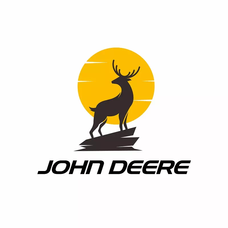
The logo of John Deere is an interesting one. The designer has used a picture of deer in the logo that looks like a banner of medieval times. It also represents the company’s motivation and purpose for providing trustworthy services and strong facilities. So the clients can be sure about their company values. So, while designing your construction company logo, you can use such a symbolic image to represent your company figuratively.
BuildMat:
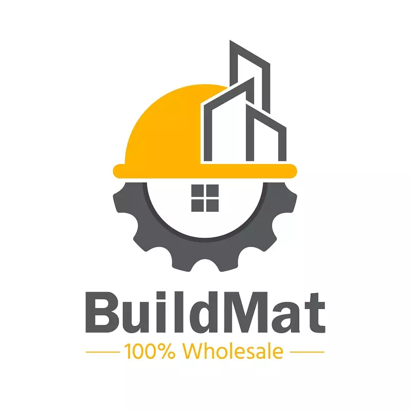
Adding a tagline to the logo is a great way to convey messages. If your company has something special to say or focus on, you can add it to the tagline. As the logo is used everywhere your company goes, the tagline will help people to know about your business. For instance, the logo design of BuildMat has used the tagline “100% Wholesale” which is the special feature that they want everyone to know. So they have added that in the form of a tagline with their company’s logo design.
Rebello Construction:
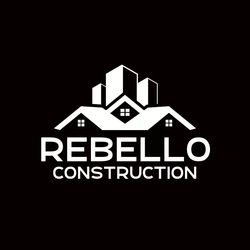
The logo of Rabello Construction is a basic and minimal design. It is a combination design with typography and illustration. The illustration shows a building image to make the logo relevant to the construction company. The best part of the logo is its color combination. In a black background, the logos designs are created in white. It’s a great way of using a black and white color palate.
Stacey Construction & Equipment:
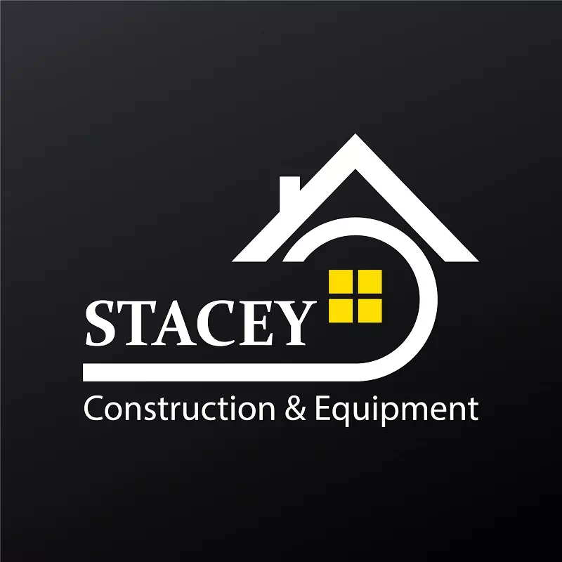
Here is another example of a combination logo design. The logo of Stacey Construction & Equipment has a roof image as an illustration along with the typography. The designer has used a bold font in big size to write the company name so that it gets the maximum attention. It’s a great way to highlight the company’s name from the rest of the words.
Layton:
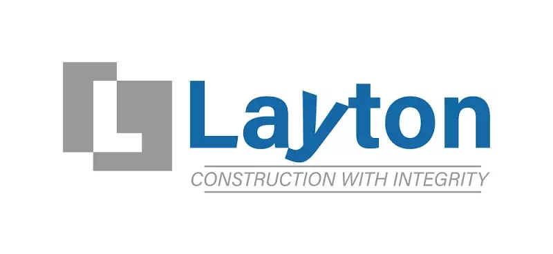
Instead of using logo images, you can use geometrical patterns to set a perspective of the construction logo. It makes the logo smart and modern. Besides, the clean look helps to build a positive first impression on the clients. The logo of Layton has a geometrical design along with the typography. They also have a tagline that says about their business policy and assurance.
Perfection construction Inc.
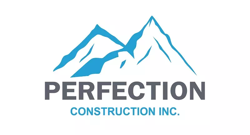
Logos serve many purposes and most of them are related to business growth and success. But that does not mean you will forget to add a bit of beauty to it. The logo of Perfection Construction INC. is a brilliant example of making the logo beautiful and elegant with minimal elements. There is a snow-covered mountain picture along with the typography. What makes the real change is the use of the color palate in the logo. The blue color is used twice- one is on the image and another is on the typography.
Here ends our list of 25 Best Construction Logo Design Ideas. As an entrepreneur, your prime focus should be on business growth and making an impression. A logo helps you greatly in that. So be confident and use all the ideas you have to design your exclusive logo. Beware! try not to use a free construction logo instead of a premium construction logo.
Benefits of a Great Logo in the Construction Sector
Discover how a great logo can be a cornerstone of success in the construction sector. In this exploration, we’ll delve into the significant advantages that a well-crafted logo brings to construction companies.
- Brand Recognition: A great logo makes your construction business easily recognizable.
- Professionalism: It conveys a sense of trust and reliability to clients.
- Credibility: Enhances your company’s reputation and credibility.
- Marketing Tool: Serves as a versatile tool for promoting your services.
- Differentiation: Helps you stand out and establish a unique identity in a competitive market.
Conclusion
Building contractor logo ideas is an essential aspect of branding for any business. It’s a visual representation of your identity, values and mission. construction logo ideas play a crucial role in shaping how your audience perceives you. So, we encourage businesses to recognize the significance of investing in a well-designed logo. Don’t underestimate the power of a great construction company logo—it’s the cornerstone of your visual identity and a key driver of success in today’s business world.
FAQs
Why is a logo important for a construction company?
A logo is vital as it’s the face of your brand, building trust and recognition in a competitive industry.
How to find construction logo design ideas?
Explore competitors and trends, and seek inspiration from design resources to adapt ideas to fit your brand.
What should a construction logo include?
Construction logos typically feature tools, buildings, or related symbols with colors and fonts reflecting professionalism.
Should I hire a professional designer?
It’s advisable as professionals can create a unique, polished logo tailored to your brand, setting you apart effectively.
How to ensure logo uniqueness?
To prevent conflicts, conduct a trademark search before finalizing your logo to protect your brand’s intellectual property.

