Adobe Lightroom is a stunning behemoth of professional photography applications with enough functions and processes to make any professional photographer crazy. At the simplest level of it, though, Adobe Lightroom was created to help us do just three main things: sort the pictures, post-process them and export them. This is a review of Adobe Lightroom where we know ins and outs of this wonderful software. Lightroom’s photo editing feature is one of the best features.
Adobe Lightroom has different camera modules for organizing and developing the images. We can retouch images in Lightroom using the very powerful processing toolkits. Once we’ve edited images we can use Lightroom to export those files as Jpegs with all the editing baked in. Lightroom is now very powerful software that has been designed by professional photographers for professional photography.

Adobe Lightroom Features
| Keyword Tagging | Yes |
| Face Recognition | Yes |
| Layer Editing | No |
Adobe Lightroom Reviews
Adobe’s Lightroom image editing application has long been a favorite one among professional photographers. They now have got a choice of flavors. Those are Lightroom and Lightroom Classic. The first one of the subjects is of this review which is primarily designed for serious kind of amateur photographers. It is for those who want to access their photos online.
It is to use some powerful editing and organizing tools. Adobe Lightroom Classic retains the initial program’s traditional user interface and toolkit for working professional photographers. Adobe Lightroom has been gradually adding a lot of features to bring the newer sibling with Classic overview. Unfortunately, the new program interface still lacks local printing, tethering, and plug-in support.
Veteran users always want to stick with the Lightroom Classic program. It is a PCMag Editors’ Choice pick. Features that initially arrived after the program’s main release included the ability to export to the DNG raw file. It also has an interface with drag-and-drop support for creating Albums. It can use keywords for shared albums. It holds the keyword auto-completion.
Adobe lightroom photoshop
It has now worthy of watermarking. It can adjust the local hue adjustments, color correction, different versions, and collaborative photo editing. Both Adobe Lightrooms applications now have an amazing Texture slider. The AI-powered Enhancer Details tool is also amazing. The newer Super Resolution enhancer tool debuted in Photoshop in the earlier stage.
The nifty Profiles feature offers amazing treatment options. It is for converting the raw camera files into viewable pictures. Those determine the basic starting point of the editing journey. Some creative Profiles in Lightroom that are similar to the Instagram filters join the same old Raw Profiles.
These Profiles can be used on JPGs as well as for the raw pictures. Adobe Lightroom now has the panorama effect and HDR-merging capabilities tool. At this point, the simpler point in the interface-based Adobe Lightroom offers nearly all the actual photo-editing tools found in Adobe Lightroom Classic. Like, save Post-Crop Vignetting, set Profile calibration, and Flat-Field correction. These all are quite advanced options. More notable action is missing-in-action features. It is concerned with organization, workflow, and output.
Adobe Lightroom Price
You have at least three different options while buying the newer Adobe Lightroom. The Adobe Lightroom plan runs at $9.99 per month. It includes 1TB of online storage. Without this plan, we don’t get access to Adobe Lightroom. The amazing Photography plan, also $9.99 per month. It only includes 20GB of web cloud storage.
Getting the full Lightroom package with 1TB online cloud storage costs an additional $10 per month. Of course, we’ll get all three programs with a full, $52.99-per-month Creative Cloud subscription. Though that offer only comes with 100GB of cloud storage. The package is upgradeable to 1TB for an additional $9.99 per month. All of the storage plans include Adobe Portfolio, which lets us create a web showcase for amazing photography.
At about $120 per year, Lightroom is a little bit more expensive in the long run than competing image editing applications such as Capture One ($299), CyberLink PhotoDirector ($50). There are also the DxO PhotoLab ($129-$199), ACDSee Ultimate ($99), Corel PaintShop Pro ($79), and Skylum Luminar ($69). Keep it in the mind, too, that those applications are one-shot prices and Pay once.
We own the application forever unless a major upgrade would want to come along. Even in the short run for those, the application doubles the price of Zoner Image Studio. It has a $4.99-per-month subscription fee (or $49 per year) with 20GB of cloud storage. That program keeps working in a nice mood if we stop paying—we just won’t get the future upgrades.
When it comes in the terms of cloud storage, Lightroom can also be pricey compared with the other special services. A terabyte of OneDrive cloud storage costs about half alike an Adobe Lightroom subscription, at $69.99 per year.
Adobe Lightroom Premium
It also includes image syncing along with all the Office generative productivity applications. For the same $9.99 per month as Adobe Lightroom, Apple’s iCloud gives us 2TB—twice as much as Adobe Lightroom. Here Google Drive also charges $9.99 for 2TB. If we don’t mind saving a compressed version of our image, we can upload everything for free of cost.
Installing the application is a very simple matter of tapping and getting it Installed in the Creative Cloud utility. Another proper way to get Adobe Lightroom is from the Microsoft application Store on Windows or the Mac Application Store on macOS. With either impacted the installation option, an auto-app-upgrade setting saves us from worrying about whether we’re running out of any latest version.
The application runs on macOS 10.14. Later on the Windows 10 version in 1903. It now supports both in Apple Silicon M1 and in Windows on ARM. The Adobe Lightroom app takes up 1.3GB on our hard drive. It is half a gigabyte less than the Lightroom Classic.
Adobe Lightroom Interface
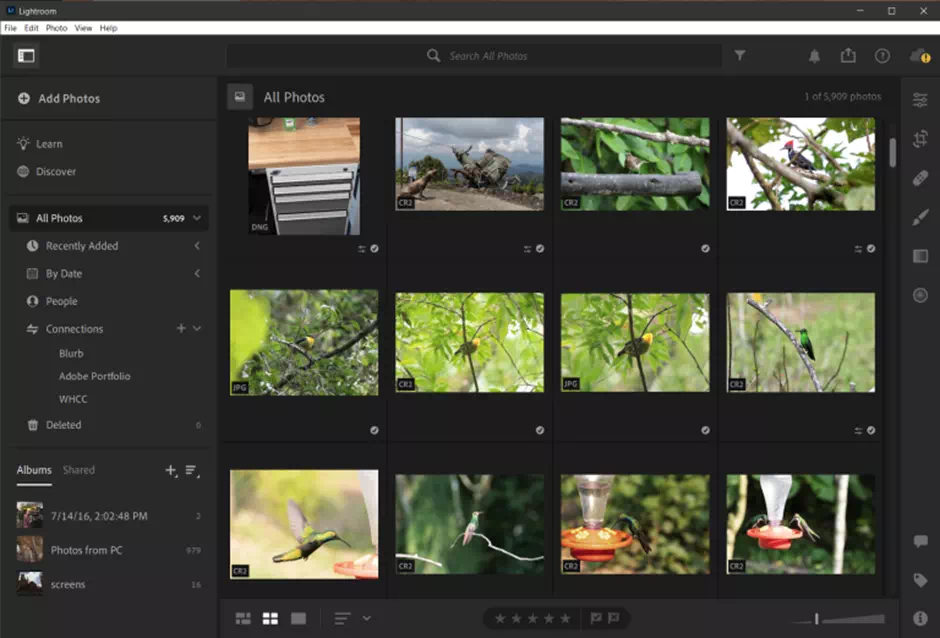
Adobe Lightroom sports a refreshing and clean interface. It features the theme of what Adobe product director Tom Hogarty calls “progressive disclosure.” That means it starts with a simple disclosure and then reveals increasingly complex tools as we need them for our projects.
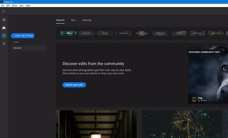
The main interface now has four special buttons along with the left rail. Those are A-plus signs for adding images, Home, My Photos, and Sharing options. The Home screen shows new tutorial videos along with a row with the thumbnails of the images. Users spend most of their time in My Photos, where they can select and restore photos. A user can switch that process to a contact-sheet view and sort by their import date, capture date, or modified date.
With this artificial radical rethinking of Adobe Lightroom, Adobe ditches the proper actual modes of its predecessor. They are the Library, Develop, and the rest items. Aside from the real rows of the synced images, the user interface is notably sparse. Organization processes and adjustment toolkits are hidden behind the box.
The control slider icons are set at the left and right side edges, respectively. The main organization panel and the adjustment panel don’t show properly at the same time. By default, when we open one slide, the other closes respectively. Thankfully, we can change this type of behavior in Preferences by switching the control panels from Automatic to Manual.
Adobe Lightroom Frontend
In My Photos, The thumbnail in the tile view opens an image in full view by Double-Clicking. Again Double-tapping takes us back to the actual gallery view, just as happened in the Adobe Lightroom Classic.
Tapping the full image view (the cursor sign appears as a plus) enlarges the picture to 100 percent. After that, the cursor mood changes to a hand. It is letting us drag the photo around the full area. At the bottom right side, there are also Fit, Fill, and 1:1 choices processes. There we can see an Original button, but no side-by-side before-and-after view stuff such as we can get it in Lightroom Classic.
We can use the mouse while holding down the Ctrl to zoom in and out. This process only stops at the major points like the fit, fill, and 1:1. We don’t get here a zoom slider showing the percent, as it does in CyberLink PhotoDirector.
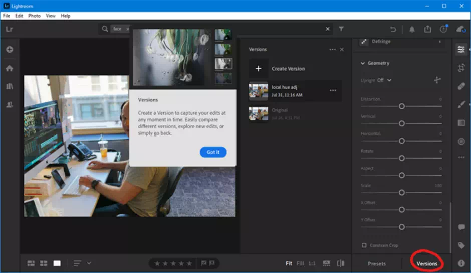
The June 2020 new update can create and edit the versions, so we can compare two or more edit processes in this interface. We simply tap the different Versions option at the bottom-right of the main adjustments panel. A Versions panel pops were out to the left of the partial adjustments. It is giving easy access to multiple version designs.
How to customize Lightroom
One thing here to note is that we can’t edit a particular version. Once we create it, its adjustment areas are fixed, though someone can continue image editing with the edits in place for another particular version. We can always use Ctrl-C to copy the actual particular edit settings from the editable version.
As for the touch input, Lightroom is much more adequate. We can easily use those buttons and control panels via touch. We can tap or unpinch a picture to zoom in to its last level. Adobe Lightroom Classic (as well as Photoshop) features offer a full-touch mode for tablets. It also offers touch-screen PCs too such as the Surface Book.
Adobe Lightroom includes a tutorial boatload to help and tutorial content. If we click the question mark at the top right side we can get started. There’s an animated visualization that helps all the individual adjustment issues, along with the wizards that use sample pictures from famous photographers to show us exactly how they edit a perfect product picture.
Lightroom Adjustment Slider setting
It even shows their particular adjustment slider settings. The collective help is context-sensitive for a perfect setting. For an outdoor portrait image, it aptly proposes the tutorial called Enhance Natural Light Portraits to improve the Contrast and Color. We welcome such types of amazing things built right into the application. By contrast, all of the Adobe Lightroom Classic’s help is a kind of web-based tactics.
For those users who aren’t got old hands at photo editing, correction, and enhancement, the program’s animated feature creates sample editing steps It can be of great assistance in getting those staters started on an image editing journey.
The amazing edit guides show the technical effect of each adjustment area in sequence. There is nothing that is stopping us from simply messing with the tool sliders to get a look, of course. It perfectly suits our taste. Still, everyone doesn’t need to reinvent every proper wheel.
Lightroom import settings
Neither Adobe Lightroom nor the Classic version pops up as an Auto-Play option when we insert an Artificial SD memory card. We may like to press the big Import button, but with the new Lightroom version, we need to press the + button.
Then we need to choose the source folder or card in the interface. When we import images from a camera’s SD card, we may see a grid of all the card’s pictures, unlike the previous versions of Adobe Lightroom. This iteration doesn’t let us view an image at full size before importing it to its full potential.
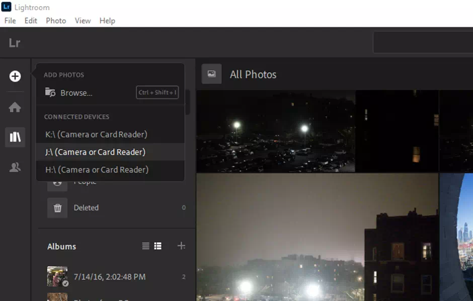
When we import, all the pictures that are automatically getting a backup to Adobe’s main servers. Hands-off to the people that will probably appreciate this kind of amazing job, but we’d prefer more careful control over what has been uploaded. We can pause the whole uploading system, but we can’t be specific in the folders and files we don’t want to get uploaded.
Adobe Lightroom classic can exclude pictures from uploading to the web cloud. Also, we can look there (or even to the main Windows Images app) for automatic importing photos from the folders we specify.
Import Images in Lightroom
The importing process has long been one of the pain points of Adobe Lightroom. Many complaints have come on image forums and blogs about its idleness. We also hate wasting some pretty much amount of time to upload and storage space with photos we may not want to save.
The image professionals with loads of RAID cloud storage probably want everything imported. They also want this to happen fast. To be fair, importing the images is now faster in Adobe Lightroom (and also in the recently updated Lightroom Classic).
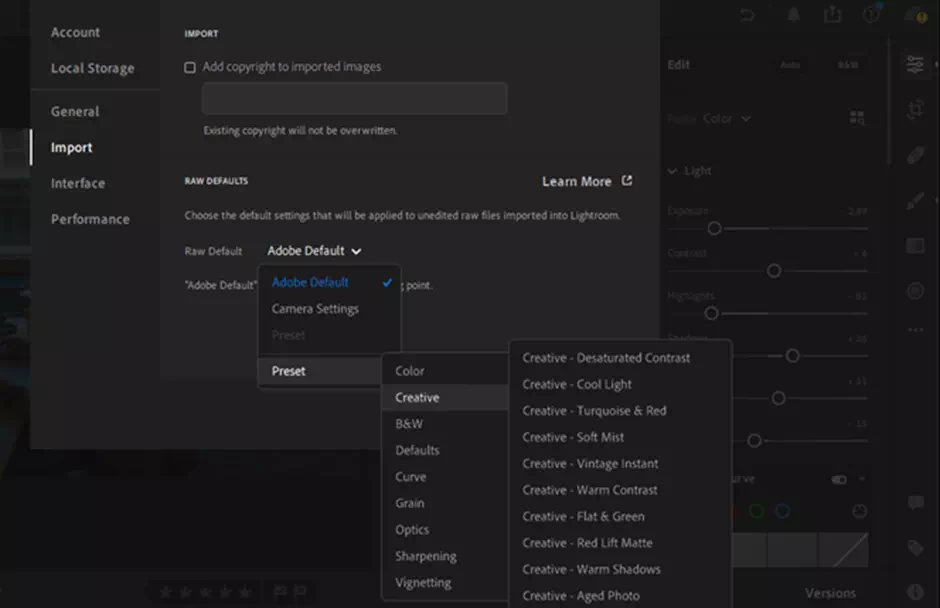
At import, we can choose to add photos to a special noticeable album. After the June 2020 update, It got the ability to choose a default raw import image setting, however.
This lets us not only choose a standard raw import style option such as Adobe Color, but we can alternatively choose amazing effect-like default imaging such as the Vintage Instant Creative suit. We can have a custom preset created as default at import imaging, as well.
Image Importing Interface
We tested the import performance with 190 raw file formats from a Canon 80D to our Windows 10 PC with 16GB DDR4 RAM. There was also a 3.4GHz Intel Core i7-6700 CPU, and an Nvidia GeForce GTX 745 discrete graphics card designer. Adobe Lightroom took 5:04 for the import, which was on the top end in the field.
For comparison, Skylum Luminar took 5:03 rapture. Adobe Lightroom Classic took 3:51. Capture One took 4:55. Zoner Photo Studio took 4:54. Note that the Adobe Lightroom (non-Classic) import time doesn’t include completing uploading the photos to the cloud storage. It just imports the images into the local application.
Adobe Raw Profiles Lightroom
If we want to get the most image editing potential out of our digital camera for real, we need to import the raw camera files. When we import raw files, the application translates the remaining raw data from the camera sensor into a viewable picture, using a portable rendering Profile.
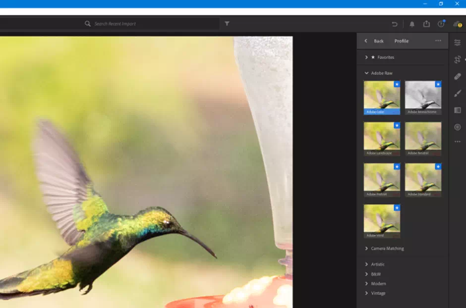
The Portable Profile option already existed in Adobe Lightroom and the Camera Raw, but it was the only way down in the Camera Calibration section. It only offered a few basic amazing choices and most of them were based on the camera manufacturer’s application. Now they’re holding the position at the top of the Edit adjustment panel.
They’re also more reflective of Adobe color technology than that of the actual camera maker sight. It’s very much important because it’s the starting point for any other photo editing to do. It makes sense to put the initial option at the top of the basic page.
In the recent pro photo application reviews, We can see that Capturing images has done a great job of initial raw conversion. The images look better right after we import them and make the actual adjustments. Phase One’s application brought out a more detailed view and color than Adobe’s blander like Standard Profile. The Profiles in Adobe Lightroom have gone a long way towards rectifying the fact.
The Photo Profiles come in two main domains: raw and creative. We can make choices in the first group and that is Adobe Raw and Camera Matching. While the Creative options like Legacy, Artistic, B&W, Modern, and Vintage are doing a great job too. The initial raw Profiles only work with the raw pictures.
Lightroom photo editing
The last four special effects also work with the JPG pictures. The Browsing option shows square-shaped thumbnails in the profile, which we can hover over with the mouse to preview the main photo legacy window. We can also choose our Favorite Profiles. That will appear in the top group of the thumbnails.
When it is included in the Adobe Lightroom Raw group they are Adobe Color, Landscape, Neutral, Portrait, Monochrome, Standard, and Vivid. We expect the Adobe Color Profile to be the most popular item. It’s the default application for newly imported images. It gets a bit more ratio of contrast, warmth, and vividness out of the image than Adobe Standard.
It is the same as the previous version of Adobe Lightroom. For some initial test shots, particularly in the color portrait sections, Lightroom’s initial rendering to Capture One’s is preferable. It is especially when we use the Portrait mood and Landscape Profiles pretty appropriately. Note that images we’ve already viewed to import will retain the legacy of Adobe Standard Profile. It usually gives a less pleasing result than the newer Profiles of Lightroom.
The initial Camera Matching Profiles is simply the best mimic of the camera manufacturer’s picture rendering. They’re solely designed to match what we can see on our camera LCD or the JPG the camera frame produces. We find the next latter less pleasing than the Adobe Lightrooms Profiles. They were either too cool in pre-initial projects or just oversaturated for a Canon 1D portrait.
Culling Photos in Lightroom
The Monochrome Profile, because this profile starts from the raw camera picture, is a far better option than starting with an Adobe color Profile and then converting them to black-and-white.
The Portrait mood is designed to reproduce the skin tones more accurately, while Landscape straight adds more vibrancy to the picture since there are no actual face tones to worry about image distorting. The neutral view has the least contrast, which is more useful for difficult lighting situations. The Vivid area punches up the saturation level and contrast.
The Creative suit Profiles will conjure the notion of all kinds of Instagram filters. Disappointingly, they have those silly names like Artistic 01, Modern 04, and so on. We’d prefer names that can give a clue about what the effect does to the image rather than numbers. By contrast, the Alien Skin Exposure offers so many presets for the image, every one of which has a descriptive set of the name.
Despite that quibble, the Creative Profiles do great and add interesting feeling, usually without being too much obvious. In some cases, they’re creating a barn new and a one-step improvement set of design. Sometimes It’s become with the new era which is impressive in how it varied the 17 B&W choices.
Lightroom Editing Photos
The organization of the search bar in Adobe Lightroom uses AI technology to let us find particular objects like mountains, buildings, dogs, and more. Version 2, suggests a particular search based on what we start typing.
We like the amazing filter option that lets us select the camera models, keywords, and locations, but Adobe Lightroom Classic and DxO PhotoLab go beyond that. It is letting us filter by the lens, F-stop, focal length, or even ISO.
As for the most advanced AI object search, that’s already available in Microsoft Photos, Google Photos, Flickr, Apple Photos, and Adobe Photoshop Elements. At this point, we can’t consider it as a differentiator. Our favorite implementation project of this is that of Flickr since it actually shows the automatically generated object from the keyword tags which all its competitors hide and even lets us edit the items.
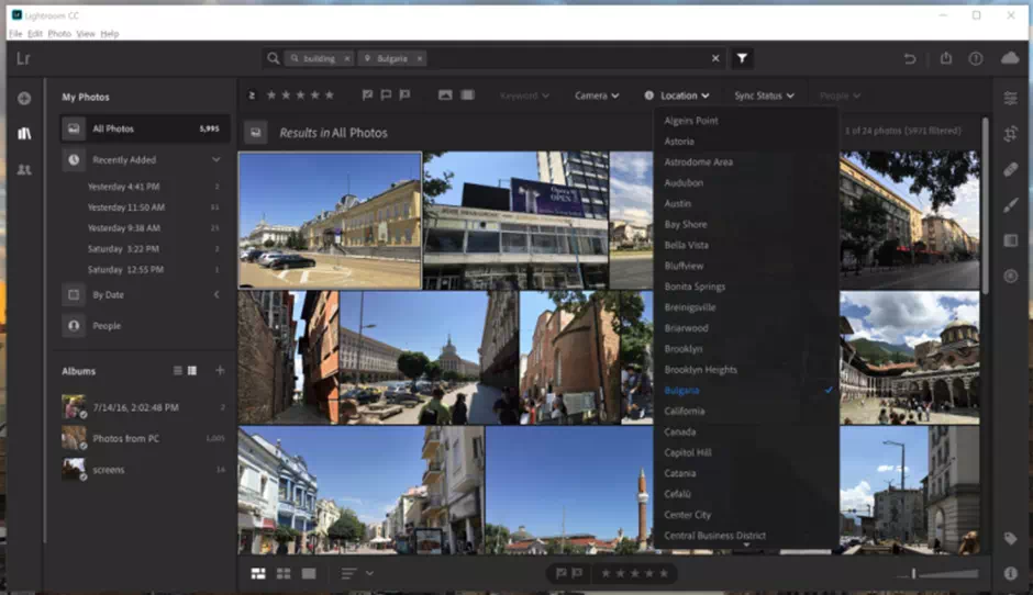
We can organize our Lightroom profile collection with star ratings, albums, and Pick and Reject the flags. We also don’t get color labels, as we do with ACDSee Pro and CyberLink PhotoDirector nor do we get Smart Collections like those that Adobe Lightroom Classic can create. It is based on dates and tags. We can now, however, add keywords, through the initial entry system and that doesn’t have Lightroom Classic’s hierarchical keyword suggestions.
Lightroom enhance details of Images
Nobody here likes to admit that they use Adobe’s Auto button to see if the particular program can improve their images automatically. Everyone uses it to see what the actual program recommends. We like that the button in Adobe Lightroom is easier to find. It shows exactly the sliders that it’s adjusted (Adobe Lightroom Classic does that thing, too).
In the testing, it was quite awesome at fixing underexposed images, but often applied too much HDR which look overly brightened to an image that was already pretty bright. Even when we searched for using the term “bright” it would generally further brighten the image that remains in another part of the application. It had been deemed a bright area. To be sole fair, a test shot in a snowfield with the hazy mountains was dazed and not brightened in a nice mood.
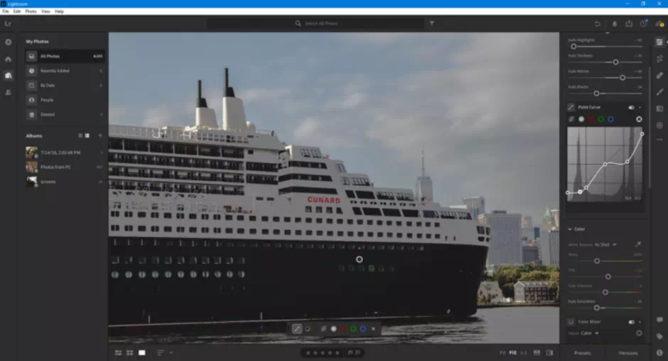
We’ll get all the proper and expected lighting adjustment sliders: Contrast, Highlights, Shadows, Whites, Exposure, and the Blacks. Lifesavers useful Clarity and Vibrance are also here in Lightroom. Dehaze is also available.
It mostly works well, though DxO. PhotoLab’s clear view does a far better job without adding initial color and casts in some test images. The Point Curve adjustment is a wonderful twist on the standard Curves control tool. The program includes that part. We can adjust the targeted curve to a point in a particular picture by dragging the mouse a little bit.
Lightroom Presets
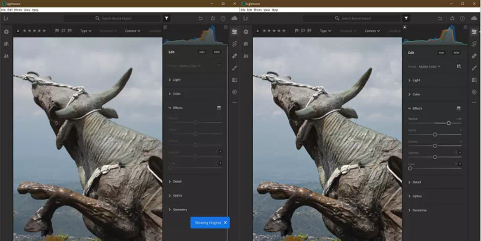
The Texture slider is the program’s newest slider. It lets us add or remove the medium detail we used before. It is as opposed to the necessary fine detail that the Sharpen adjuster does affect. We can use the Texture slider as either a local or global adjustment.
We can also use this tool to smoothen the faces without giving them an artificial skin-tone, doll-like look. In the picture below, we can see that increasing the Texture adds detail but doesn’t affect so much noise in the sky the way Sharpen does.
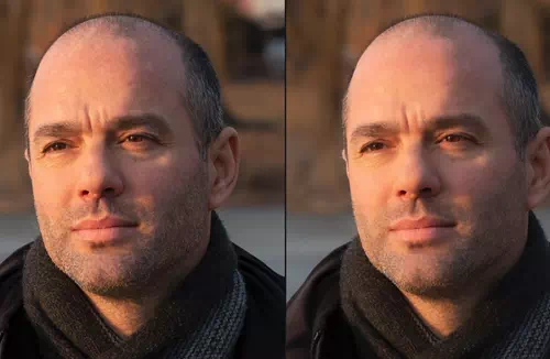
And in the following example below, the left is the original one, and the right has a Texture slider set into -30:
For some uncertain reason, we can’t use the mouse wheel to increase and decrease the particular adjustment slider positions as we can in Classic. There’s also no history panel showing all the changes in our images. We do like that double-clicking slider returns it to its origin based-position. The Reversion to the original button is supposed to hide under the overflow menu. We’d rather have it always quite accessible.
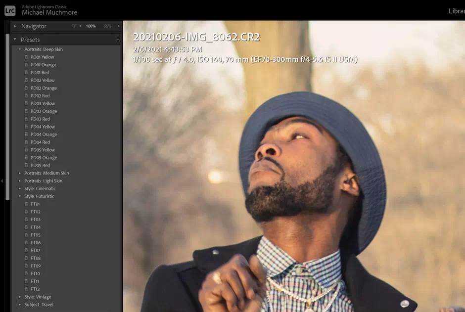
As with nearly all images apps these days, Adobe Lightroom lets us apply so many amazing filter effects. They give this chance via the Presets link at the bottom of the window panel. The June 2021 upgrade beefs up these levels, with 70 presets designed by stunning professional photographers.
Make your own Lightroom Presets
We get a good selection of colors. We can use black and white, fabulous grain, and vignette preset adjustments areas. We also can see the after-effects applied to the image as we hover the mouse cursor over the app. Adobe Photoshop Elements offers quite more options and control panels with its more wonderful filters, however.
Cropping the images is well implemented here with a good choice of adjustment preset aspect ratios. There’s even happened to be an Auto-leveling option that works well adoptedly. With the June 2021 upgrade, the crop toolkit finally lets us create a custom aspect ratio in the adjustment presets.
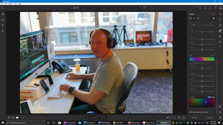
A Healing Brush along with an Adjustment Brush is easy to access here. The Linear and Radial Gradients toolkits are also happily available here. It is in pretty much the same form as those in Adobe Lightroom Classic. This application will allow a user to do local adjustments to the specific areas of the picture. New for the June 2020 upgrade is a local hue adjustment brush. It is helpful, for example, if a face tone is overly red but a user doesn’t want to reduce a particular red channel in the rest of the image he can use this to rectify the image.
Lightroom face recognition tips
The People’s view of the image uses AI in cloud storage (dubbed Sensei) to the automatic detection of the faces in the image. These show-up circles in an image view all shots of what the AI considers the same person’s face are grouped. We add a name to the groups where we’re interested.
We can merge different circles that show the same person’s face, since, as with all people-recognition applications. Sometimes some duplicates show up here, thanks to the new feature of the differing camera angles, eyewear, lighting, and so on.
Adobe Lightroom does a wonderful job at identifying and grouping people. When we see it we’ll get impressed with how it asked out correctly, if it should merge down the pictures of the same person’s face with dark glasses and in Photo profile view.
One issue here that Adobe Lightroom users for a long time will run into is that the new feature is completely separate from the People recognition feature in earlier versions of Adobe Lightroom. People that we tagged in those frames won’t appear in Adobe Lightroom’s People feature, even if the images are synced to Adobe’s cloud storage.
Merge photos in lightroom: Panorama and HDR
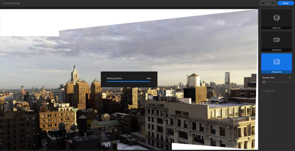
Picture-merging capabilities came in the application with the February 2019 upgrade of Adobe Lightroom. These include HDR, Panorama, and HDR Panorama. The HDR Merge toolkit offers just three options. They were checkboxes for the Auto-Align process and Auto Settings enhancer (auto-enhance), and a typical slider for de-ghosting the image.
The latter is to improve and remove the objects from the initial merge. We don’t get all the particulars options after the image merge that we do with the Alien Skin Exposure, such as B&W and Artistic. That will be stunning and fine for those who just want a light-balanced texture of the picture. The fabulous panorama-merging toolkit is similar to that in the Adobe Lightroom Classic. It produces a good and seamless result for a particular type of image.
As in Lightroom Classic, we get options for spherical, cylindrical, and perspective projection modes for newer kinds of images. You also have the actual option to Auto crop, reset, and remove non-rectangular edges from the texture area. Boundary and Warp slides stretch the Picture edges so we don’t have to crop as much detail to the image.
Enhance Details and Super Resolution in Lightroom
The Enhance Details arrived in the February 2019 upgrade, uses machine-learning or AI support in Windows PC and macOS application to rectify and clarify the complex parts of a picture. It’s a subtle after-effect for many images. It doesn’t do a whole lot to the image, especially for the initial parts of the imager that have a consistent texture-based area. Our access to the application Enhance Details from the Picture menu (or from the right-click menu).
Then we see a dialog with a lot of detailed views of the shot. Running to the next it creates a new DNG file format. There’s a little high estimate of how long the detailing process will take, but in the testing area the toolkits took quite a bit long time to complete than the estimated 10 seconds, rather it takes more time like a full minute.
On some of the early tries, it also caused the whole program to quit unexpectedly. It happened on a 50MB NEF file format from a Nikon D850. We got an error clarified message saying that the picture couldn’t be loaded at the main site. As noted, the effect is quite subtle. If we zoom in a lot on the image, we see some pixels of different textures.
We thought that when someone looked at the whole picture at 1:1 magnification, there created an impression of greater sharpness to the rear, but several amazing colleagues couldn’t set to see any differences. On some other shots, the difference was noticed in rare cases, and on some, it was only noticeable at 2:1 glorified magnification. It might create a meaningful difference at a larger point on the print, however.

Sharing and Output
Sharing and the output section remain one of the major weaknesses for Adobe Lightroom. Most consumers who use this amazingly balanced Adobe Lightroom will likely try to share their images to a few common places like Instagram, Twitter, Facebook, and Flickr.
They also may try to print their images. Adobe Lightroom doesn’t offer those options. The lack of this printing capability is particularly flabbergasting in all the eras, especially in that the application has been upgraded several times since its first release.
Though we still can’t print the image directly from the program, we can send images to Blurb for the book with the printing and to WHCC (White House Custom Colour) for the amazing wall art. There’s still no way to get the handheld images printed, aside from exporting pictures and uploading them to an image printing service or printing them by using the portable operating system’s feature of the printing process.
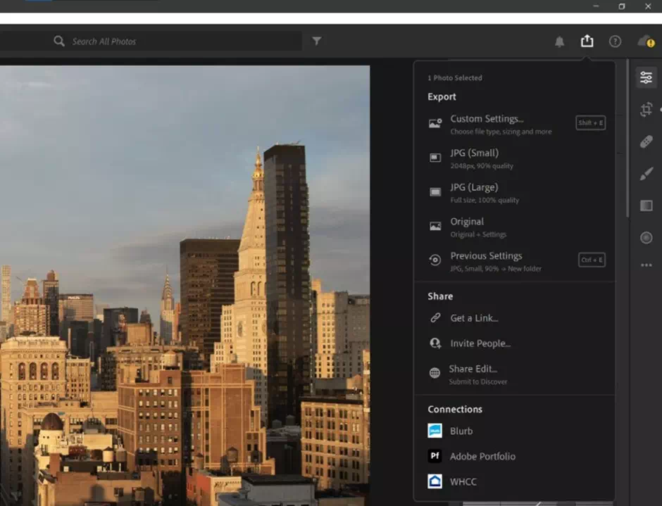
Our output choices have been increased by this time, however. We can now save the file to DNG and TIFF file formats as well as save JPGs and the original raw file format with a sidecar XMP settings file format. There are differing critics and views on DNG, but it uses less cloud storage and includes stunning metadata.
Lightroom Filter
It edits without requiring the sidecar file format. Since Adobe Lightroom syncs everything to the portable cloud storage, the only reason we can think of for exporting to the DNG is for backing up to the surface and archiving the test results.
We can also upload our files to Adobe’s Portfolio and in the web galleries. Adobe Lightroom’s online-based art galleries present the pictures well. It also allows sharing via the same link. They allow multiple contributors where each of which can add their images to the My Photos Albums. The online image galleries let us permit or can also disallow downloading the image, EXIF viewing, and location viewing.
We can’t convert images to different file formats, as we can in Corel PaintShop Pro. So, if we need a PNG or GIF, we need to look elsewhere. We can go for Ditto for the soft proofing. At least we can now fully rename the file-formats at export. We can, however, specify a detached pixel measurement for the larger and longer side of the picture.
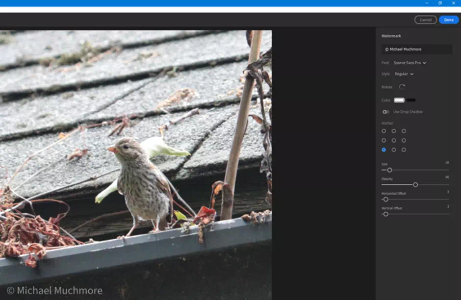
The watermarking subtle feature that arrived in the June 2020 upgrade lets us choose a different font, portable style, initial rotation, stunning color, and even drop the shadow effect. It’s a total welcome addition for those who like to make their brand public.
Lightroom Collaborative Editing
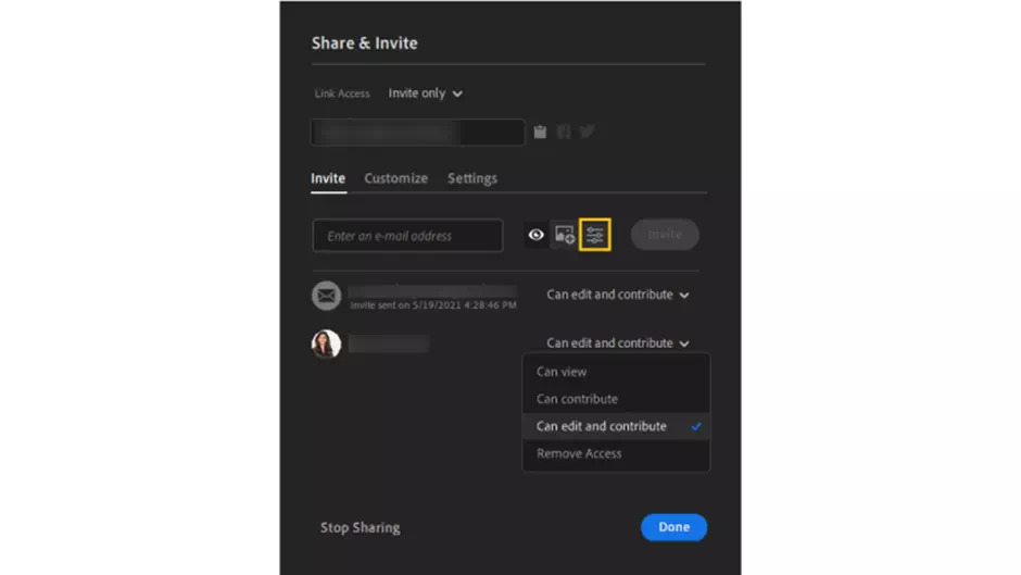
There is another share option that is to Invite a contact list of persons to edit like an image. From the Share menu, we choose and invite different People, where we can specify whether we want the invited people to be able to view their face, contribute, or to contribute and edit the images in an album.
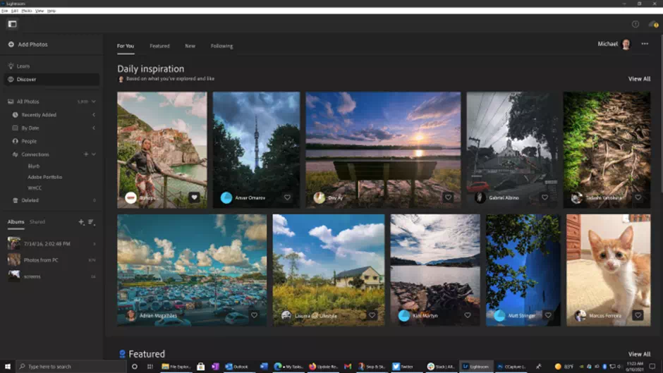
A final type of sharing option is the Share Edit. This submits our image along with all the necessary adjustments to Adobe Lightroom for inclusion on the Discover tab. There, we can also follow the contributors and save their edits as different brand presets to use on the set images. We can tap a heart icon to show the sole admiration.
Mobile App and Website
As a portable mobile app, Lightroom is more than something impressive. Here it is more amazing than its desktop counterpart. It even boasts the Person and Profiles features, along with a texture slider controller to the Upright, Guided tool Upright, and a new set of Geometry tools.
All the same, images we see synced in the desktop application also appear in the portable mobile software. Here we can even get the gradient toolkit and brush for the selective editing and adjustments. The latest version lets us pick a specific color tone to use with the brush and gradient toolkits. It is particularly useful for skies too. It also includes chromatic aberration and correction with effective noise reduction.
We can set the application to automatically upload the images and get a shot on the device to our Adobe Lightroom cloud storage. Here we can search, filter, and tag our pictures. In addition to all the post-shot options, we can use the fabulous in-app camera.
It boasts exposure compensation with the simple swipe of it and can use a White Balance tool. It also has the most amazing HDR feature, and best of all saves the initial result as a raw file format. In all, it’s great to use in the mobile picture application. It’s available both in an Android app or on the iOS app, and both work identically amazingly.
Lightroom Tools
Lightroom’s features and web galleries bear a strong set of resemblance to the newer Adobe Lightroom software. The left organization tools and panels show the same list of amazing albums, but its Add images option is in a different raw place, above the image collection is quite handy and worth remembering.
We can also move and create our new albums in the webs user interface. If we share an image, we can choose a layout and get a single portable URL to share an album full in a public. A dashboard shows the recent amazing albums, imports by month, and stats, such as how many images, albums, and videos we’ve added.
COST
MSRP $9.99
$9.99 Per Month Adobe Lightroom CC
See It
$19.99 Per Month Photography Plan (1TB)
PROS
- It is simple and the clear interface makes it worthy.
- It is fully automatic and syncs the images to the cloud storage.
- It has powerful raw profiles and filters.
- The Panorama and HDR stitching are amazing.
CONS
- Can’t choose which photos to sync
- No local printing
- No plug-in support
- Expensive
- Limited sharing
Adobe set its classic goals to the photography enthusiasts with this newer version of Adobe Lightroom’s professional picture workflow program. Slick and nimble, it now boasts over most of Lightroom Classic’s image-editing tools, but still lacks some workflow features in the main app, local printing, and plug-in support.
We can expect that the lacks will disappear in the later version. The companies are also creating so many teams to find out their faults. We can hope for the best at reasonable prices.

