Engineering companies need to make their brand name trustworthy and reliable. Also, they need to reach the clients by competing with other fellows. In that case, a professional logo can make the job much easier. Logos attract the eyes and make people engaged with their appealing design and vivid colors. So there’s no denial of the importance of a well-designed logo.
Before heading towards designing the logo, you must know what suits the engineering logos best. Also, the symbols, icons, and colors all are important elements to make the logo more beautiful and effective in its job.
Have no worry! We have made an extensive list of 25 Best Engineering Logo Design Ideas to help you out. Check it out-
Concord Engineering:
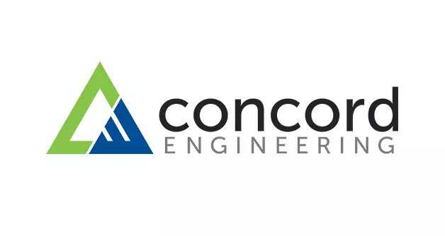
The logo of Concord Engineering is a minimalistic design in a combination style. It has a triangle illustration that is nothing but the initial letters of the company’s name. Also, they are in different colors to make a versatile look. Another notable thing is that the designer has kept the first word in all lowercase while the last word is all uppercase. It’s a nice trick to make the logo a bit much interesting and intriguing. For your engineering logo design, these techniques can help a lot.
Interface Engineering:
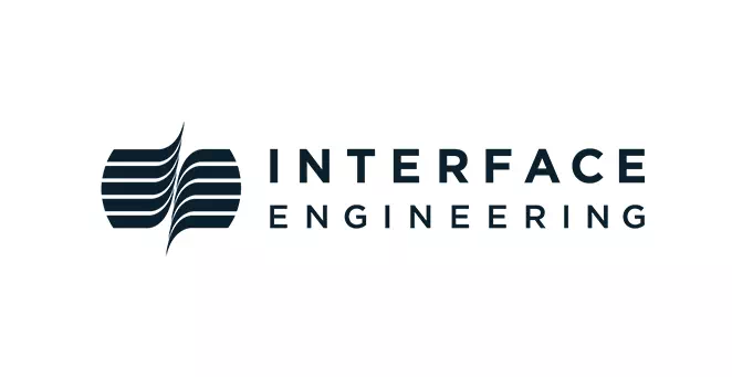
Black and white logos are suitable for all sorts of company logos. So you can choose it to design your engineering logo as well. Interface Engineering has a black and white logo to represent its brand identity and name. You can experiment with different shapes and illustrations with this type of logo. But we recommend going for minimal designs so that it doesn’t look overdone.
Imaginationeering Design Solutions:
Imaginationeering Design Solution has got a peculiar design that can inspire you to go for unusual designs. As the logo is one of the permanent features of any company, it is meant to be interesting and relatable. Anyway, in the sample logo, there is a hand-drawn wheel that sits in between the typography. The color combination has given the logo a subtle and attractive look as well as fitting. For your engineering logo design, you can create such a design to keep the clients engaged.
360 Engineering:
The logo of 360 Engineering is another inspiring design for you. The entire design is monochromic meaning there’s only one shade of color in the logo. There is a building in the logo referring to the company’s dealings. The round-shaped arrow represents their holistic approach in the engineering field. So, to make your perspectives clear, design the logo with meaningful icons and symbols.
Roadlink:

Wordmark logos are greatly chosen nowadays for their versatility and utility. These logos work amazing for engineering companies as well. The sample logo is of Roadlink’s. It is a vibrant neon blue color in the background that helps the wordmark design to pop even more. Also, the font is another cool feature of this logo. So, if you wish to go for wordmarks, you can’t give up on choosing a suitable font.
Kreator:

Abstract patterns have an extraordinary effect on the engineering logo design. They make the logos a lot more artistic and attractive. For your engineering logo, you can create a design with relatable abstract patterns. The logo of Kreator has an abstract pattern of eyes that represent the company’s potential for good services. Along with it, the designer has combined bold typography to make the design balanced and compatible.
Modlr Design & Build:
Another amazing element that you can use for engineering logos is the geometric pattern. It also makes the logo thoughtful and worthy. The logo of Modlr Design & Build has a geometric pyramid shape that represents the company’s services. It concerns building and designing and the patterns perfectly show you that. That is how you can communicate with the clients through your logo.
Well Fort:

Here is one more inspirational geometric logo design for you. Geometric cubes complement engineering logos perfectly. So there’s no way you can go wrong with it. Customize the cube according to your need and the result will be amazing. The sample logo of Well Fort has used a three-dimensional cube pattern that looks brilliant and intriguing. They have kept the color monochromic that has added more elegance to the design.
Civic Engineering:
The logo of Civic Engineering has a lettermark design that consists of the initial letter of the company’s name. But the entire logo is not a lettermark. The designer has kept the logo a combination design by twinning typography and the lettermark. Also, there are two colors in the logo that has made it clean and lively. To make your engineering logo unique and exclusive, you can go for such designs.
Alpha Omega Geotech:
The name of your company can give you ideas on how to design its logos. If you don’t want to go for conventional logo designs, experiment with the company name. For example, the logo of Alpha-Omega-Geotech has designed its logo with lots of unusual elements. They have used the initial letters and the omega symbol to create an identical lettermark. Also, the word Geotech is in customized design. that is how you can make your engineering logo suitable and representative of your company.
Walt Disney Imagineering:
The logo of Walt Disney Imagineering is a mascot logo that has the identical mascot of the Walt Disney group. The font is also the customized font of the company. Using a relatable mascot is a smart way to build a brand face. It must represent your company’s values and perspectives. It will not only make the company trustworthy but also keep it compatible with other companies.
Intonovi:
Geometric designs look sturdy and add a new dimension to the logo. For an engineering logo design, you can choose this style. Here, the sample logo of Intonvi has used a geometric illustration. It has made the design a lot more sensible as an engineering logo. Also, the different shades of orange color have given a charming and lively look to the design. Follow these techniques and your engineering logo will be as effective as you want it to be.
Bytebase:
If you want to take your engineering logo design to the next level, you can experiment with different patterns and styles. For creating a trendy design, choose a 3D illustration to complement the logo perfectly. The software engineering farm Bytebase has a 3D illustration along with the typeface. The neon color has given it a vivid look as well as made it pop more.
ENV:
The initial letters of the company name give the perfect elements to design the logo meaningfully and relevantly. It makes the logo exclusive and absolutely unique. So, you can experiment with that. The logo of ENV has set an inspirational example of this idea. Look at the symbol in the logo and you will find all letters of the company in the design. It makes people stop a bit and interpret the messages that you have kept in the logo.
Next Level Engineering Inc:
If you want no illustration in your logo and keep it simple elegant, the best choice is wordmark design. Here is just the right amount of room to experiment with this style. The logo of Next Level Engineering Inc shows you the way to do so. The font used here is unusual and a customized one. Also, colors play a role in every design to make the logo a lot more versatile and appealing.
West Star Aviation:
The emblem logo is considered to be a classic style to the designers. It suits all types of companies and makes them grow more. So if you like to have an old-school emblem logo, here is an inspirational design for you. The logo of West Star Aviation is a black and white emblem logo with a circular pattern. You can choose other emblem patterns if your design requires.
Defiant Engineering:
The logo of Defiant Engineering is an interesting design in combination style. It is mainly a typography logo with a symbol made with the initial letters of the company. The notable thing here is the bold and thick serif font. Also, the color combination is brilliant for attracting the eyes. If you want your logo to be successful with its design, these are the things you must take seriously.
Rodinia:
The logo of Rodinia is another combination design with an eye-catching color in the illustration. The illustration used here is actually the initial letter R of the company’s name. There is a tagline in the logo as well that has increased the logo’s sensible attempt to convey its messages. It makes the design a lot more engaging and worthy of a successful engineering logo.
Molina Engineering Ltd:
Modern and minimal designs suit engineering logos well. Also, it makes the logos impressive and memorable. Besides, clearer logos seem to get quick attention than others. So, it is a safe option to experiment with this idea. The logo of Molina Engineering LTD has a minimal design with a combination style. It has basic typography and a geometrical illustration. Both of them are complementary to each other therefore making the design sensible as an engineering logo.
Implement Engineering:
The logo of Implement Engineering has an inspirational logo design for those who want to take their logo design to the next level. There is no limit to creativity and experiment in logo designs and this sample logo is the proof of that. It is a monochrome logo with complimentary illustrations and typography. The illustration is the main attractive part here that has brought a lot more freshness and life to the design.
Lifeguard Engineering:
The logo of Lifeguard engineering is a metallic design with a silver and red color combination. Metallic logos represent strength and give a friendly powerful vibe. It is great for using in engineering logos for its metallic and trustworthy look. The negative space is used to make room for the illustration. For your engineering logo, you can go for metallic illustrations. Not to forget, the negative space is there to support your experiments.
X Cost Value Engineering:

Here is another cool idea to make the engineering logo unique and catchy. The logo of X cost is a basic and straight letter mark design. But the most attractive part of the logo is the letter X. It has been written in a peculiar form to make the logo simply outstanding. You only need the creative idea to create such an effortless logo for your company.
Arilev Engineering:
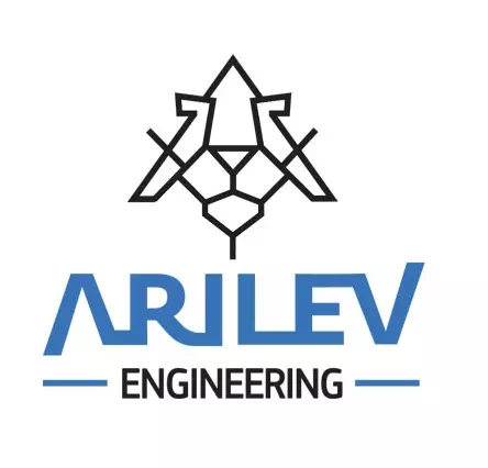
It is another geometric logo to inspire you. The logo of Arilev Engineering is notable for its two amazing elements. One is definitely the geometric illustration of an airplane and the other is the quirky font of it. The font alone has made the logo quite outrageous and bold. Along with it, the illustration has given the much-needed balanced look to the logo.
Iron Wolf Engineering:
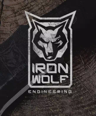
The logo of Iron Wolf has presented their inner strength and passions through an animal pattern in the design. It is another sort of emblem shape. Also, the logo has created an outstanding ambiance by choosing pale colors and customized font. The effort is not so hard here, yet the result is satisfactory. So, for your engineering logo, you can choose such patterns that will show your company’s perspectives as well as serve as a mouthpiece successfully.
Repeatable Engineering:
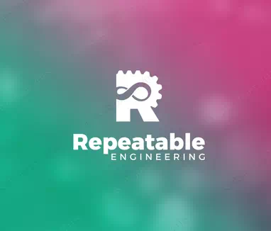
The last idea of this list is again a combination logo with minimal features. The logo of Repeatable Engineering has used an illustration in the shape of its initial letter R to make the logo exclusive for the company. The logo is monochromic and gives an eye-catching look that makes the design quite successful as an engineering logo. So, if you want to make your company logo to be memorable and engaging, go for such ideas.
Image source: looka and 99design
Now, we have reached the conclusion. As you have already seen the list contains versatile ideas and useful tips and tricks to inspire you. So, it is your turn to brainstorm a while and create a unique logo for your engineering company.


