The cosmetics and beauty product industry is already a well-established one and still holds a great opportunity for entrepreneurs. As it is growing rapidly, you have many chances as well as competitors. So for surviving here, you must need a great strategy. A beauty brand logo can come first among all of your many strategies. Logos are influential and make people intrigued to a great extent whereas logo design is partially a big matter.
Cosmetics & Beauty Brand Logo
Logos are different depending on the company’s services and products. There is some certain type of fonts, icons, illustrations that suits the company type most. If you are looking for those ideas, you have ended up in the right place. We have got a holistic list of logos from renowned brands to new ones so that you don’t miss a thing.
Check out the list here.
Earth Love Cosmetics:
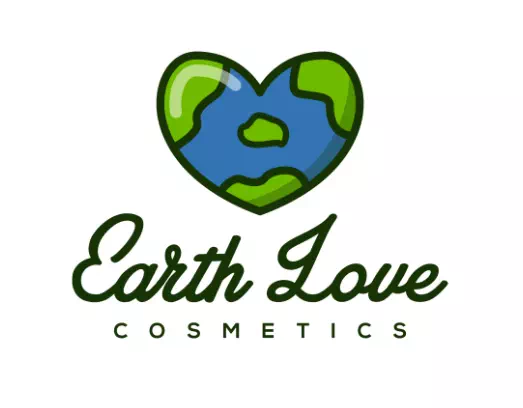
The logo of Earth Love Cosmetics is a perfect example for those entrepreneurs who want to show their brand’s perspectives through the logo design. In fact, it is a great idea to design the logo this way. If your cosmetics and beauty products brand is eco-friendly and emphasizes natural ingredients, the customers should know it. And before heading into your website or product packaging, they can learn it from the logo design.
Aria Lavino:
Using the brand or the company name’s initial letters to create a symbol is a common design in logos. But most of the time symbol is placed before the name. To bring a unique style, you can place it wherever you want. For instance, the logo of Aria Lavino has used the symbol in the middle of the brand name. It has made the logo more attractive and unique. For your cosmetic and beauty products logo, you can follow this style.
Busy Brainy Beauty:
Cosmetics and Beauty Products logos are best suited with aesthetic, elegant designs and patterns. We are not saying that it is the only way rather there is the freedom to create such designs for cosmetics and beauty brands. Anyway, the logo of Busy Brainy beauty has an appealing logo with a customized symbol. The symbol is nothing but the letter b designed in a woman’s face shape. It points to the fact that the brand’s targeted customers are mostly women. That is how -through the logo design, you can show a certain perspective of your cosmetic and beauty brand.
Beauty Highlighted:
Beauty Highlighted is an organic beauty product and skincare brand. You can know about the perspective of the organic through their logo design. Also, they have used a lustrous shade of honey color, making the logo catchy and charming. To keep the design minimal and free from haphazardness, the designer has kept the font simple. It’s a great way to make the logo design balanced without reducing its beauty.
Honest Nature Cosmetics:
The logo of Honest Nature Cosmetics is an ideal example of a minimal yet elegant cosmetic and beauty logo. There is no overflowing of colors and fancy fonts in the logo. Still, it has acquired its own kind of beauty. The negative space has been used to make room for the symbol made with initial letters. The complementary clean font choice has made the logo eye-soothing and gorgeous. Similarly, you can have a good start for your business with such an effective logo.
Iceland Cosmetics:
Iceland Cosmetics is a cosmetic beauty product brand from Iceland and the logo is clearly showing that. In the logo design, the designer has used the map of Iceland to make it relevant. Anyone can immediately recognize the brand’s identity through the logo design. Besides, the black and white color palette has given the logo more depth and complements.
The Ordinary:
The ordinary is a well-known skincare brand from Canada. It is famous for its minimalistic use of ingredients and chemicals. The name of the brand also speaks for its aims and motives. That is why the designer has kept the logo super simple to do justice to the brand’s identity. It is a wordmark logo which means there is no other design in it. If your cosmetic brand has such a special approach, you can present it through your logo design.
Angelic Artistry:
Apart from simple designs, most companies prefer using a pretty-looking logo for their cosmetics and beauty logos. As they work with things that enhance beauty, the logos are the representation of that. For instance, the logo of Angelic Artistry has used an emblem style with a copper color and a calligraphy font. Both of the elements have made the logo lively and exquisite.
Makeup Forever:
Makeup forever is another famous makeup brand from France. As much as it is known for quality products, the logo design of this brand is another of its beauty. The alluring image of lips and eyeliner has made the logo quite relatable with makeup and beauty products. So, using an eye-catching and breathtaking image or illustration in the logo can make it way too impressive and effective as a design.
Urban Decay:
Who doesn’t know the brand! The logo of Urban Decay stands for the brand’s mouthpiece as a high-end luxury cosmetics and beauty product. It is clean and simply gorgeous as a logo design. When you are confident and optimistic about your brand, you don’t need to make it loud. The minimal design of the logo reminds you of this. So it is no wonder, a well-chosen font and color palette can make your cosmetic and beauty logo a lot more attractive and effective even if you don’t go for elaborate designs.
L’Oreal :
The French brand L’Oreal has a wordmark logo with clean serif font in bold form. The logo design looks much more balanced, even if it does not have any illustrations or icons. So there’s no worry of going out of trend if you choose only wordmark format for logo design. Rather it shows your confidence and perfection in the field you are working in.
Ulta Beauty:
The logo of Ulta Beauty is a classy and elegant one. Like other famous brands, it is also a clean and minimal design along with a bold font. It can be considered as a wordmark logo as it does not have any illustration in its design. However, the color and the font have done all the job of beautifying the logo. So, you can also go for simpler logo designs for your cosmetic and beauty product brand.
Aussie:
Aussie is a renowned brand from Australia and the logo design of it does not forget its root. The designer has used a playful image of a kangaroo in a form of illustration in the logo. It has given the logo a unique look along with making it way too recognizable and memorable. These sorts of smart designs are worth trying in cosmetic and beauty products logos. If your goal is to create something phenomenal, never underestimate the power of creativity in logo designing.
Larina:
Larina is a nail studio and we can know it at the first glimpse of its logo. It has an elegant look with an illustration that shows nail art referring to the company’s services. It makes the logo smart as well as communicative for the customers. It has a customized font as well to represent the company’s goal for aesthetic and beauty purposes. That is how you can show a certain perspective of your company through the logo design.
Kiw.ma:
Kiw.ma has got an adorable logo design with an enchanting shade of purple color. The logo design is super simple and there is no denial of it. To keep resemblance with the name the designer has used a geometric icon of kiwi. It has made the logo more meaningful and relatable. So you see it is not so hard to design a logo that will speak for your company as well as keep the customers close.
Dove:
The logo of Dove is a combination design with a handwritten font. It also has got a dove icon to match the name perfectly. Besides, if you look closely- the entire logo will look like a girly face. All of these elements have made the logo a timeless and exceptional one. The logo can be a great example for entrepreneurs who want to build a strong image of their new brand.
Be Bare Skincare:
Here is another inspirational logo design for cosmetics and beauty brands. The logo of Be Bare Skincare is a combination logo with a customized icon and font. It is an ideal example of modern and minimal design. It proves that simplicity brings elegance and magnificence to any logo design. So if you want to make your cosmetic and beauty logo identical and memorable, go for such minimal designs.
Lauren Cosmetics:
The logo of Lauren Cosmetics is looking like a hand-drawn design with its calligraphy font and icons. What makes the real difference is the color and size of the elements of the logo. The design is balanced and pretty neat. As it is required to be in product packaging, website, brochures, and so many other places, the clean design serves greatly. Such designs are easy to create and effective in their purposes.
Beauty By Misha:
The logo of Beauty by Misha is an ideal example of feminine design for its heart-melting illustration and the color palate. It is an easy way to make the logo exceptional. If you want to use an illustration in your logo design, be confident and go for something striking and inspiring. As long as the design is meaningful and relatable, it will help the business to grow. Use customized fonts and icons to make your brand unique from competitors.
The Raw Botanics Co:
If you feel your company has some special features and goals, you can show it through your logo design. It will make the logo a lot much relatable and significant. Besides, the customers will have no hassle understanding your motives. You can get the much-needed brand image through such designs as well. The logo of The Raw Botanics is an ideal example of all of these techniques.
Hank & Henry Cosmetics:
The logo of Hank & Henry Cosmetics is a combination of line-art and typography. The golden color has taken the design to a new height. You can be inspired by its organizational style and for good reasons. It has kept a pretty neat look with a skillful arrangement. If you want a combination design for your cosmetic and beauty brand, bring out an icon or illustration that will complement your business perfectly.
Primrose Organic:
The logo of Primrose Organics is another inspirational design. It has a semi-circle or half-circle pattern that has made the logo professional and polished. The color palette is almost close to vintage shades and perfectly suits the design. The fonts are a bit blurry but within a balanced level. So, if your goal is to create something different for your cosmetic and beauty products logos, try out these techniques.
Ousia:
Using only one color in the logo design makes it way too gorgeous and smart. It gives the logo a clean look that is equally elegant. The logo of Ousia has got such a logo design which has only one color. The grass-green shade has made the perspective clear that it is an organic brand. There is the use of two different fonts in the logo and that is another of its beauty element.
Brushjunkie:
Don’t take logo design as a tiresome job. Be playful and sportive as much as you want. It will make your logo a token of good vibes and charm others. Anyway, the logo of Brushjunkie happens to be following this technique. Instead of ‘U’, they have used a brush sign that has made the logo not only relatable but also pretty attractive. Such mood-lifting logos attract the customers and make them engaged with your company.
Lunabloom Cosmetics:
Lunabloom Cosmetics has got an outstanding logo design that can inspire new designers. What is great about the logo is it successfully relates the name and its aesthetic approach. The designer has made a combined illustration with the moon and blooming of flowers. The color is a soft pink that has made the design more appealing and fascinating. Such logos are memorable and easy to detect from everywhere.
As you have seen here, logo designs are not at all complex rather pretty easy to do. All they need is relatable and meaningful icons, illustrations, colors, and fonts. Arrange all the things together, and you are good to go. We hope this list will help you to create the exclusive logo for your cosmetics and beauty product brand.

