It is not any new news that our environment is dying slowly. That is why it is important to focus on it more than ever. Many companies have already decided to go green and clean that will be harmless for nature. Also, many movements and campaigns are growing to protect our mother nature. So this blog has been written based on the nature of the environment where you will get a clear environmental logo design idea.
A logo that hints at environmental issues or simply reminds you of the greeneries is getting preference by many companies. So you can choose one for your company too. It can be a company of green energy or automotive or a cosmetic brand.
Photo Credit: Looka & 99design
It really does not matter what the company type is, you can always choose a logo for the environment or a green logo. And if your company is already dealing with the environment, what are you waiting for?
Here, we have collected 25 Best Environmental Logo Design Ideas with tips and tricks to inspire you.
Green Peace:
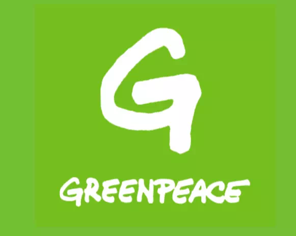
The logo of Greenpeace is a simple yet powerful one. The bright green color immediately catches the eyes and sets a positive impression. It is easy to connect and relate. On the other hand, the font used here is another of its amazing features. It gives a playful vibe that uplifts the mood of the entire design. You can choose such a minimal design to show your love for nature.
Coral Reef Alliance:
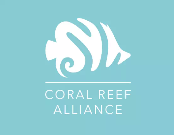
Coral Reef Alliance’s logo is another inspirational environment logo for a non-environmental company. There is an abstract image of coral that perfectly resembles the company name. A simple font has been used here with the illustration which has given a balanced look to the logo design. Again, the monochrome has added another layer of beauty to it.
Bellus:
One simple way to design your environmental logo is to add a meaningful illustration to it. The eco-friendly logo of Bellus has done that quite successfully. Such designs are not much elaborate yet set a positive vibe. It is engaging and identical which is much- needed for a logo design. So, if you want a logo that will not only speak on behalf of your company but also remind them of nature, here you go.
Energreen:
Logotype of Evergreen is one more simple yet elegant environment logo design idea for you. Here you can see the leaf illustration that connects the design with the environment. This little detail has completely changed the ambiance of the logo design. Also, the font is not at all a basic one. It is a moderately fancy logo that has brought a more exotic look to the design.
Battree:
Battree’s logo is as fascinating as its name. Like we said many times sometimes the company name can show you the best direction of designing the logo. The designer has combined battery and tree in one illustration. Such designs make the logo identical and memorable. You cannot deny its powerful approach in attracting the eyes and giving a positive first impression.
EPA:
The logo of EPA is a combination logo that has a meaningful illustration and typography. The illustration shows you a combination of two leaves, the Sun, and the sea. All of these elements give you the impression of nature. Along with that, the bold typography in monochromic color makes the logo even more striking and recognizable.
Solar Quest:
A creative and intelligent approach can increase the beauty of your logo more than anything. The logo of Solar Quest has done such a thing. The sun image is made with electric plugs that relate to the company’s name. The bright yellow color represents the sun perfectly. Also, the two shades of green color present the company’s green consciousness in their journey.
Nature Canada:
Nature Canada’s logo is an absolute inspiration for creating uncommon unique logos. The initial letter N is designed in a wave shape that gives the perfect impression of the sea. Along with that, there is an awesome combination of colors.
The blue and green color has made the logo more nature-centered and attractive. So, if you want to create meaningful and relevant environmental logos, here is your example.
Vitapus:

The use of green color makes the logo relatable with the environment and nature much easily. So, you can play with different shades of green in your logo. It also makes the logo a lot more optimistic. In that way, the design connects itself with the outer world successfully and effectively.
Vitapus’ logo has used such a luxurious green color to speak for the company’s perspectives. Also, the little detail of a tree shape has made the logo a bit relevant with its causes.
WY’ East Foundation:
WY’ East’s logo is an awesome example of combining creativity with designing skills. Here is a colorful illustration of two leaves that have been designed with the letter W. the use of multiple colors has given the logo an aesthetic look. Overall, the logo looks promising and impressive enough to catch the eye. So, following this way, you can get the exclusive environmental logo for your company.
Upforest:
Now here is a clever and smart logo design. The logo of Upforest has an intelligent illustration that shows upward arrows. The most amazing part of the design is the arrows look like trees and the color combination is brilliant. The deep green is at the lowest height and the light green is at a bit higher height. It quite resembles real-world forests as well. Therefore, such tricks make the logo appreciative and a lot more attractive.
Marcellay Landworks:
Marcelly Landworks has a logo that is one of the brilliant environmental logo ideas for your company. It is a combination logo with a significant illustration and complimentary typography. The illustration is designed like a tree shape that has the company name’s initial letter in it.
Also, the monochromic use of white color has given depth to the design. All of the elements have made the logo perfectly put together and balanced.
AO landscape:
Do you want to make your logo perfectly resembling your company’s name? If yes, the sample logo here is an ideal example of that. The illustration of the logo is created with A and O along with a tree. All of them make the perfect sense as the logo of AO Landscape. Also, the black color has made the design a lot more identical and clean.
Green Charge:
The logotype of Green Charge is a fantastic logo with a bird pattern. Here the illustration of the bird is a combination of bird and the lighting sign that relates it to the company’s services. The green color is also significant here as the logo represents a clean energy source. Following this way, you can make your company’s perspective clear that it cares about the environment and Mother Nature.
Suns:
Suns’ logo is a minimal and simple logo design idea with no extravagant illustrations. It only has a friendly-looking sun with the initial letter S in its bosom. Also, they have added a tagline in the logo to make their points clear. Now let’s talk about the extra thick and gothic serif font that perfectly complements the entire design.
Impact Outfitter:
Playing with colors proves your effort and skill in logo designing. But as you are making it for a company, make sure it is relevant. The logo of Impact Outfitter has chosen two representative colors namely green and blue that are mostly connected with nature. Also, the circle gives the perfect impression of an environmental logo along with the colors.
Breathe Well:
This logo of Breathe Well has an excellent combination of different shades of blue color. If you look closely, you can find that all the blues are not the same. It has made the logo not only eye-catching but also identical. Anyway, the cloud shape with a house sign complements the logo even more.
And to make the company’s perspective visual noteworthy and clear, the illustration has worked well. The designer has used a lowercase bubbly font which is another of its beauty.
Pleasant Nature:
If you want your logo to appear beautifully and keep a long-lasting effect on the mind, the design has to be a phenomenal one. The logo of Pleasant Nature is an exemplary logo of this kind. The hand-drawn branch has given a significant amount of elegance to the logo which is charming as well as appealing. Also, it makes your perspectives clear. It speaks for nature and your concern for its protection.
Naturally Creative:
Logo of Naturally Creative is a minimalistic and straightforward logo design idea. It is the perfect example of keeping the design clean and compact. The designer has put a relevant illustration with complimentary, simple typography. Still, there’s a little twist in the letters.
All of these elements have made the logo unique and exclusive for the company. For designing your environmental logo, this can be an ideal inspiration.
Bio Lastics:
Here is another simple environmental logo design idea. The logo of Bio Lastics has kept the design totally free of any elaborate icons or illustrations. Pixlr has essential typography and a little complementary symbol. It defines the company’s perspectives successfully. It is notable in customer engagement as well. So now you can be sure that simple logos can serve every bit of your requirement.
The Behive:
The logo of the Beh ive is an ideal example for those who enjoy being adventurous while designing their logos. First of all, the design is quite smart and colorful. So there’s no denying that it will catch the eyes. Also, the mixture of lowercase-uppercase fonts has taken the design to another level.
The designer has blended creative ideas with designing skills excellently. So for your logo, you can experiment to create something like this sustainability logo.
Eco Eggs:
Apart from all sorts of ‘serious’ designs, let’s move on towards a fun logo. The logo of Eco Eggs is a poultry company that has designed its logo from that point of view. The use of green color is the visual proof of their eco-consciousness. Also, the bubbly font has given the logo light and easy-going mood. And not to forget the big illustration of a friendly chicken has made the logo out of the world.
Agrio:
The logo of Agrio is mostly a wordmark logo with an illustration that complements the typography. Anyway, there is nothing that you can call extravagant in the design yet simplicity is its feature. Such no-nonsense logos are ideal for use everywhere and in every form. They are versatile and effortless. So, you can choose a simple environmental design to represent your company’s values and services.
Semtrio:
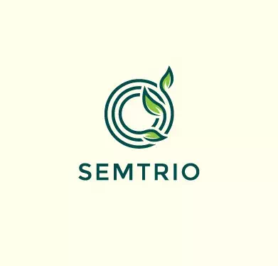
Sometimes a smart stroke of the pen can bring out an extraordinary result. For the logo of Semtrio, it is absolutely true. The illustration that you see is a combination of three circles with leaves. It matches the company’s name and its perspectives.
Such intriguing logos are great for creating a brand identity that will be recognizable to anyone. The designer has kept the font simple to give an organized and clean look which is truly praiseworthy.
Permigardo:
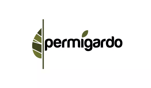
The logo of Permigardo is a peculiar design, we must say. It is a thought-provoking design that lasts in the mind for a long time. So getting represented is easy with such logos.
However, the illustration is the most notable part of the logo. It is a half leaf with different shades of green. Along with that, the soft-edged bubbly font has given a charming look to the logo. Overall, as a logo for the environment, it is quite ideal and inspirational.
We have reached the end of our list. Now you know which colors and icons work great for environmental logos. Therefore it is your turn to execute these ideas into your very own logo design.
Anyway, we are the environmental logo maker whom we think you are looking for. Get the low-price logo design service from us. We create the best quality environmental logo or green logo for an eco-friendly company that serves people close to nature. Try us.

